

The Flags of Lincoln, Nebraska
The Flags of Lincoln, Nebraska
Because everyone's getting a new flag

All right, all right. We’re officially getting into “be the change you wish to see in the world” territory here, because Cedar Rapids getting a new flag is one thing, but now Lincoln, Nebraska is getting in on that action and my dear old hometown of Iowa City is busy slapping murals on every open wall space they can find.
Don’t get wrong: I have no problem whatsoever with public art. As a longtime resident of Iowa City, I’d be excited at the prospect of bringing back the old mural in what used to be Blackhawk Mini Park downtown that they uncovered and then promptly covered up again with a new building1. If they want to slap a mural on every wall they can find, that’s perfectly all right with me. But damn it, after seeing these designs: we need a new flag. (Because I’m also honestly not sure what the flag of Iowa City actually looks like.)
But anyway: here’s my ranking of the final four flags for Lincoln, Nebraska!
The Six-Pointed Star
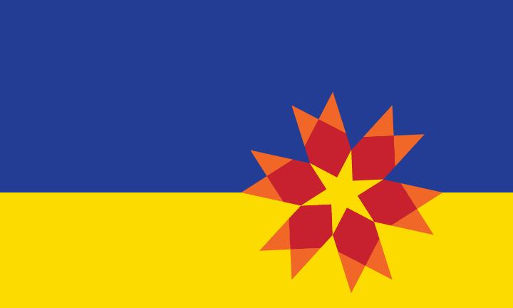
Here’s the official description from the Lincoln-Journal Star:
The six-pointed yellow star signifies Lincoln being Nebraska’s capital city. The six arrows pointing in communicate that Lincoln is a welcoming city for refugees and immigrants. The red color acknowledges the University of Nebraska and Lincoln’s overall educational values. Lincoln is a hub for innovation and technology. This is represented in the flag by the red hexagons that point into the star and out to the smaller orange shapes. Lincoln is a big city with the feeling of being a small town so that the star is offset to the lower right quadrant to provide the perspective of that small-town Nebraska feel. The blue and the yellow in the background represent the State of Nebraska and the important role that Lincoln plays as a location for many state activities. The star is placed right on the horizon (where the blue and yellow meet) to represent the dreams, opportunities, and adventures that we can pursue in the City of Lincoln.
Okay, first of all: hot damn is that a lot of meaning and description. To be totally honest, it might be a little too much description to be totally frank. But, that being said, this flag just pops. Absolutely 100% pops! It’s striking, it grabs the eye, it just leaps out at you. I love the star being slightly off-center too, especially out towards the right where it’s more likely to be visible when the flag is flying. This is a fantastic design!
Art Deco Sunset

Here’s the official description from the Lincoln Journal-Star:
Inspired by the art deco architecture and native peoples’ artwork displayed inside the capitol building, the flag uses simple lines to convey Lincoln’s past and its progressive future by alluding to the interconnection of technology, agriculture, and commerce. Whether you’re a lifelong Lincolnite or a recent refugee in our town, there is hope and optimism here. These values are visually represented by the radiating, concentric artwork symbolizing a “beacon” or safe harbor for those looking to better their lives. Some of the recognizable imagery implied by the lines are the state capitol building, a sunset, and an aerial view of the traditional center of town. (13th and O Streets.) The colors are based on the Nebraska state flag. The yellow was modified to look closer to the gold and the blue was shifted to teal by adding a green hue as a tip of the hat to the verdant tapestry in Lincoln which is home of the Arbor Day Foundation and many city parks.
Love the Art Deco feel to this design. It’s striking, I love the concentric lines and I am on record as being a fan of teal in flags. The official description says that the yellow was shifted to gold, but I’m not sure that really shows up in the image I’m seeing- maybe it would be different in person. I also feel like this one has not so much meaning jammed into it as the Six-Pointed Star. The symbolism flows better here. I’ve seen criticisms that this seems vaguely religious in nature here and there on the interwebs, but… I don’t buy it. I’ve only been to Lincoln once and I knew right away they were going for the State Capitol. In terms of capture the essence and skyline of the city, I think it more than succeeds.
The Barn Owl Flag

Here’s the official description from the Lincoln Journal-Star:
The Barn Owl derives its name from its ability to adapt from natural to man-made environments. Abraham Lincoln’s own rural origins invariably led him to the U.S. Capitol, a story paralleled by the city of Lincoln as it adapted itself from a village on the prairie to become the Nebraska State Capitol. Additionally, many of its residents have origins in more rural areas of the state, yet have chosen Lincoln as their home. For these reasons, the Barn Owl serves as a unique metaphor for both Lincoln, as well as those who call it home.
Okay, I love owls. I love owls on flags. There should be more owls on flags. This is not a trend I wish to discourage in any way and the metaphor makes sense to me, I just… I don’t know if it quite fits with Lincoln. If the state bird of Nebraska was the barn owl, it’d make more sense. (It’s the western meadowlark, btw.) Hell, if the Cornhuskers were the Nebraska Owls, it would make more sense. Apart from Union Omaha being represented by the owl, I can, off the top of my head find much connection between the owl and Nebraska or even Lincoln. Excellent flag. Love the design. The metaphor makes sense, but it’s… kind of a stretch, in my opinion.
The Abstract Quilt Flag

Here’s the official description from the Lincoln Journal-Star:
This concept visually focuses on Lincoln’s position as Nebraska’s capitol city with simple geographic elements that form the state’s outline, and a compass-style star that visually marks Lincoln’s place in the state. Large blue and gold triangles for the state’s unique outline. The upward gold triangle honors the agricultural foundation from which Lincoln grew. The light blue triangle represents Salt Creek, and its role in marking the beginning of Lincoln’s journey. The compass-style star that marks Lincoln’s location mirrors symbols that appear throughout Lincoln, including the underside view of the Capitol dome and the brick layout at 13th and O streets- an energetic central point within our city. Within the compass, white is used to established an upward, forward-pointing direction for our city, signifying growth for a community that values opportunity and progress. The gold portion represents our continued connection with agriculture, while the blue portion symbolizes health care and technology-two industries that are key to our city’s growth. As a whole, it quickly tells a story about a destination city- a place that pulls people together from all backgrounds, in pursuit of a brighter future.
Holy symbolism, Batman! My biggest critique of this design is that I didn’t actually know what I was looking at until I read the description. Once the description mentioned the outline of the State, I couldn’t unsee it. I don’t like the navy blue for the state outline though- I think they should have used the royal blue and yellow combination more strongly associated with Nebraska’s state flag and then maybe made the light blue triangles green for agriculture. Brighter, more bold colors would have made this design pop out a little more- because it’s not a bad concept. Incorporating the outline of the state and Lincoln’s geographic place in it is a fantastic way to go- it’s just that it doesn’t really pop and depending on which way you fly it, it might get lost in the wind too, especially with that blue/white triangle design piece in the lower left quadrant nearest the fly. That would have a hard time showing up on a flag pole, I think.
Lincolnites should be getting excited about this! (I hope they are!) Because these are four really excellent designs that are going to look great as a shiny new flag for their city!
The real public art restoration should be bringing back Iowa City’s iconic fountain, “Three Women Peeing” but I’m probably alone in that belief.
Thanks for your review. I really like your take on the various designs. I initially preferred the Art Deco design, but I also think the six pointed star is striking. It's been a while since I looked at them, and now I'm kind of conflicted about my favorite. BTW, I think the position of the six pointed star is also related to the location of Lincoln within the state of Nebraska. The contest generated some really great design ideas. I'm excited about an updated design for the City of Lincoln's flag. I'm glad that I could play a small role in getting it kicked off.