

Three Flags & Three Seals
Three Flags & Three Seals
Minnesota heads towards a Flag/Seal Update

Mississippi led the way with a long-overdue update to its flag. Then Utah followed suit and retired their ‘Seal On A Bedsheet’ and now Minnesota is getting in on the action and their redesign commission announced five finalists for a new State Flag and a new State Seal. We’ll talk about those in a minute, but first, we’ve got to have a wee bit of a discussion about the intersection of flag redesign and the culture wars.
Utah got a new flag but almost immediately, an initiative was launched to change it back- this, despite the fact that the old flag is going to be preserved in its elevated form as well. Residents of the Beehive State get a shiny new flag and get to keep their old one around- but unlike Mississippi, Utah didn’t let voters weigh in directly on whether or not they liked it and I think people got a little pissed off by that.
The reaction to Minnesota’s final five seemed to be decidedly mixed. Quoth this Tweet:
Flags have been used as a way to communicate since at least the 11th Century BC, detailing origin stories, histories, and traditions among other things.
Now MN can have a rich story that says, “Someone made this unremarkable flag on Canva in 10 minutes.”
Anyone who is serious about flag design will undoubtedly be aware of NAVA’s Good Flag, Bad Flag laws of flag design— unfortunately, I think designers have overemphasized fealty to these laws to the point of crowding out anything that might make a new state flag unique or distinctive. To be sure, you don’t need words on a flag and Mississippi’s new flag technically violates one of the ‘rules’ because they included ‘In God We Trust’ on their flag. But here’s the thing, they did it in a way that enhances the new design and doesn’t make the text the central design feature of the new flag. From a distance, you probably can’t tell there are words on the flag. Up close, the font is in line with the size of the stars that encircle the white magnolia blossom in the center.
So, text? Not necessarily bad. It just depends on how you do it.
I haven’t seen anyone hating on California’s design, but someone on Twitter has and I couldn’t agree with this assessment more. Don’t hate California’s flag. It’s one of the best of the bunch and it’s got some history behind it that is very relevant to the Golden State. Does it have text on it? It sure does. But: the text makes sense! It makes sense for the state, the history behind the flag, and the overall design.
(In the interest of fairness, I’ll acknowledge that Iowa’s flag violates a whole bunch of NAVA’s laws— it might almost have too much text- ten words in the motto and the name of the state makes eleven words— but it makes sense! It’s distinctive! It fits the state and our history and we have a badass motto!)
So, I do think that if you’re a state and you want to replace your Seal On A Bedsheet, you should do it. So many states are incredible, distinctive places that deserve flags that showcase what makes them unique. Seals On A Bedsheet don’t do that, plain and simple. (I would also, if it’s not too complicated, let the voters weigh in directly on whatever shiny new flag you choose— but I understand, state laws can be complex about ballot questions and stuff like that.) Whatever you, [insert state here] choose to do with your flag redesign, you shouldn’t be afraid to embrace history, tradition, and, if you think it makes your flag design better: text.
All that being said, let’s talk about Minnesota’s finalists for a new flag. I took two from the actual list that I liked and one that’s been around for quite a while now.
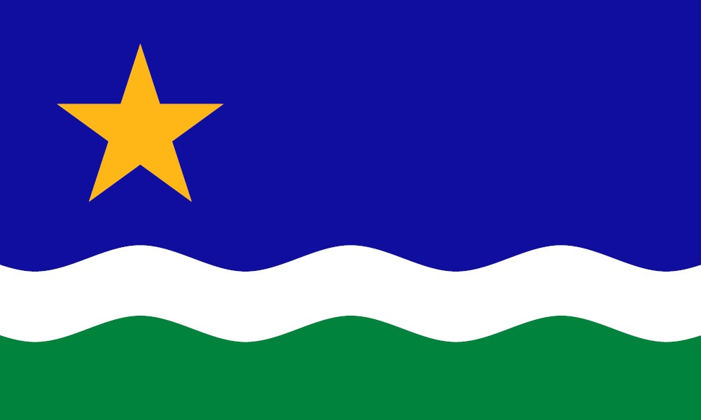
First up, Hidden Loons:

This one was my favorite of the bunch by far. You’ve got the north star represented in the upper left quadrant. And then you have an interesting, mirror-like feature of the white and blue swooshes that could be interpreted any number of ways. (The flag finalists didn’t come along with descriptions.) You can say the blue swoosh is for Minnesota’s lakes and rivers and the white is for its clouds and snow. You can say the blue swoosh represents the state bird, the loon and the white swoosh is for Canadian geese. You can say that both swooshes represent loons if you want to— or even a loon and a grey duck.
The point is, that this one is interesting, distinct, and simple. You can’t get much better than that.
Next up, Stripes and Stars:

I think it’s the star that does it for me with this one— if you’re the North Star State, it makes sense to have a star on your flag that draws the eye and this eight-pointed star definitely does. The lack of an explanation on symbolism is kind of unhelpful here, but there are also enough design elements in play that you could do a lot with this design. I’m not the biggest fan of the bottom stripes’s shade of blue- it teeters too much towards pastel turquoise when, if anything, it should be closer to sky blue. The white stripe also seems to be slightly off-color- I would imagine this is so the star seems brighter, but I’m not sure.
There’s a lot to like about this one, but it also feels unfinished to me.
Finally, the North Star Flag:
This one wasn’t on the list and it should have been. It’s been around since 1989 and has a comprehensive website with detailed explanations of the symbolism behind the flag. It’s simple, easy to draw, distinctive, doesn’t have too many colors, and has no text. Unfortunately, a good idea that’s been around for that long will eventually be recognized by someone and it looks like Duluth got there before the state of Minnesota got its act together and got behind this one- which is probably why we won’t see it make a final list. The Duluth Flag is distinctive and different enough from this design that I think you could still get away with using it- Duluth being a city in Minnesota, after all, but I can also see why they didn’t pick it.
But, it’s worthy of serious consideration in my opinion.
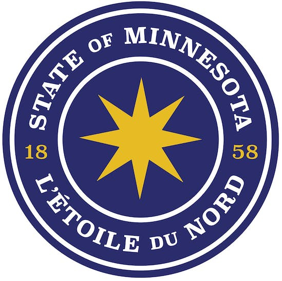
All right— let’s talk Seals. State seals, as a rule, tend to be overly busy in their design and Minnesota’s current one is no exception. It’s just too damn detailed and the inclusion of a Native American in the seal which is meant to represent the state’s First Nations Heritage also brings up awkward conversations about the Dakota War of 1862 which ended with the largest mass execution in US History and the expulsion of the Dakota people from their lands in Minnesota. In short, the determination was made that Minnesota could do better and I’m inclined to agree.
(Yes, people usually add in things about colonizers/settlers, etc when it comes to the current seal, and you can argue about that in the comments if you like, but to me what it comes down to is this: Minnesota’s history with it’s First Nations hasn’t always been the greatest and it’s Seal is incredibly busy and far too detailed. Minnesota deserves a better seal.)
First up, FC Minnesota:
I love this. I love the font. I love the star at the center. I love the colors. I think you could emboss this on official documents or stamp whatever you like with this very, very easily. It’s probably my favorite of the proposed seals, but if it has one fault, it’s that, this says… “Look, we’ve got an MLS Expansion Franchise and we’re ready to launch.” That isn’t necessarily a bad thing— certainly, if you are an MLS Franchise in the state, I would take this and run with it if they adopt it. (Obviously, change your design so you don’t get in trouble with the state!)
But I also think the MLS Expansion Franchise of it all is probably why they won’t pick this one.
Next up, Keep It Simple:
Can’t beat keeping it simple! This covers all the bases you need: it’s simple, it’ll look good as a stamp or embossed on a certificate. If you’re the North Star State, it makes sense to put that front and center and make it the focal point of your seal. I wasn’t the biggest fan of the font at first, but the more I look at it, the more it grows on me.
Finally, Loon:
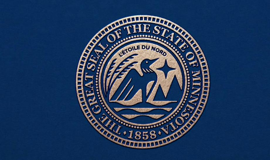
I think this is the obvious winner, to me. I don’t think it changes the font on the outer ring from what it is now, but it does make changes to the center. You get five main elements: what I’m guessing is wild rice, the North Star, hills/mountains (Iron Range), waves I’m assuming for the bodies of water Minnesota has and then center stage you have a crisp and proud loon.
This one ticks all the boxes: the unchanged font around the outside keeps design consistency from the old seal and it changes up the center and streamlines it perfectly. You don’t have all the tiny design elements. It’s not busy, it’s not crowded and it uses symbols common to the state and its history that (I’m pretty sure) are free from controversy.
UPDATE: THIS IS YOUR NEW SEAL, MINNESOTA and it’s SPECTACULAR.
January 1st is the deadline for the redesign commission to pick one flag and one seal design and submit a final report to the legislature detailing their choices. Whatever they pick will make their debut on May 11th of next year, which is Minnesota’s statehood day.
Which one is your favorite? Let me know in the comments below…