

Top 5 Horizontal Tricolors
Top 5 Horizontal Tricolors
They only seem boring... some of them are actually pretty cool.

The last time I did one of these top five lists, I looked at the infamous and much-derided “Seals On A Bedsheet”, so for this post, I wanted to explore another design aspect of vexillology that you see in many flags: the horizontal tricolor. While the French Revolution brought the vertical tricolor to national flag designs across the world, a little bit of research reveals that it was the Dutch and more specifically, the Prince’s Flag that seemed to be the first horizontal tricolor that has stood the test of time.
So, without further ado, here are my Top 5 Horizontal Tricolors:
Estonia

Ugh, sorry for the less than ideal border around this beauty. True story: Estonia is one of my favorite flags. It’s something about the shade of blue and the black— you don’t think that a horizontal tricolor would pop like this, but damn, does Estonia stand out in a crowd. Some interesting facts about this flag:
It was first adopted on July 16th, 1922. The flag was raised for the first time on December 12th, 1918 atop the Pikk Hermann Tower in Tallinn. The flag was re-adopted on August 7th, 1990 after Estonia won its independence from the Soviet Union.
The evolution of the flag began in the early 1820s when the University of Tarfu with three student corporations for every Baltic province selected their own colors which eventually became associated with those provinces (Estonia, Livonia, and Curonia). The current colors of the Estonian flag were adopted by the constituent assembly of the first Estonian national student corps on September 17th, 1881.
The Wiki-Page doesn’t seem to have any official symbolism, but what they describe as a popular symbolism courtesy of the poetry of Martin Lipp. The blue is for the vaulted blue sky above the native land, the black for attachment to the soil of the homeland as well as the fate of Estonians- for centuries black with worries and white is for purity, hard work, and commitment.
Colombia

Okay, so the colors of yellow, blue, and red aren’t exactly unique in the world, but it’s the combination that always gets me- as well as the differing proportions. The red and blue are equally sized and take up a quarter of the flag apiece, while the yellow band takes up the entire top half of the flag.
The history of South America is something that Americans should probably learn more about and maybe they do, I don’t know. I know I knew next to nothing about the history of our neighbors to the south of us1- whereas I got taught plenty of European history in school. Knowing South American history and realizing the plans for Gran Colombia (which includes both Venezuela and Ecuador) and suddenly why you see a similar color combination in those flags as well becomes very clear.
The origin story about this flag is what’s cool to me. From the flag’s Wiki-Page:
Miranda described a late-night conversation he had with Goethe at a party in Weimar during the winter of 1785. Fascinated by Miranda’s account of his exploits in the United States Revolutionary War and his travels through the Americans and Europe, Goethe told him that, “Your destiny is to create in your land a place where primary colors are not distorted.” He proceeded to clarify what he meant:
First, he explained to me the way the iris transforms light into the three primary colors… then he proved to me why yellow is the warmest, noble, and closest to white light, why blue is a mixture of excitement and serenity, a distance that evokes shadows; and why red is the exaltation of yellow and blue, the synthesis, the vanishing of light into shadow.
It is not that the world is made of yellows, blues, and red; it is that in this manner, as if in an infinite combination of these three colors, we human beings see it. A country [Goethe concluded] starts out from a name and a flag, and it then becomes them, just as a man fulfills his destiny.
I don’t know why that’s always resonated with me, but it always has. Some interesting facts about this flag:
Officially adopted as the flag of Colombia on November 26th, 1861. It was first raised at Jacmel, Haiti on March 12th, 1806 during Miranda’s ill-fated expedition to Venezuela.
The official colors have not yet been established by law, which is kind of unusual. Some flags have their colors spelled out-and I think India actually specifies material and manufacturing standards as well.
The current interpretation of the colors has yellow representing the riches of the country, the wealth of the Colombian soil, the gold, sovereignty, harmony, justice, and agriculture, as well as the Sun, the source of light. Blue represents the sky above, the seasons on Colombia’s shores, and the rivers that run through it. Red stands for the blood spilled for Colombia’s independence and also the effort of the Colombian people, their determination, and perseverance. it represents that although Colombia’s people once struggled, they have since thrived.
Armenia
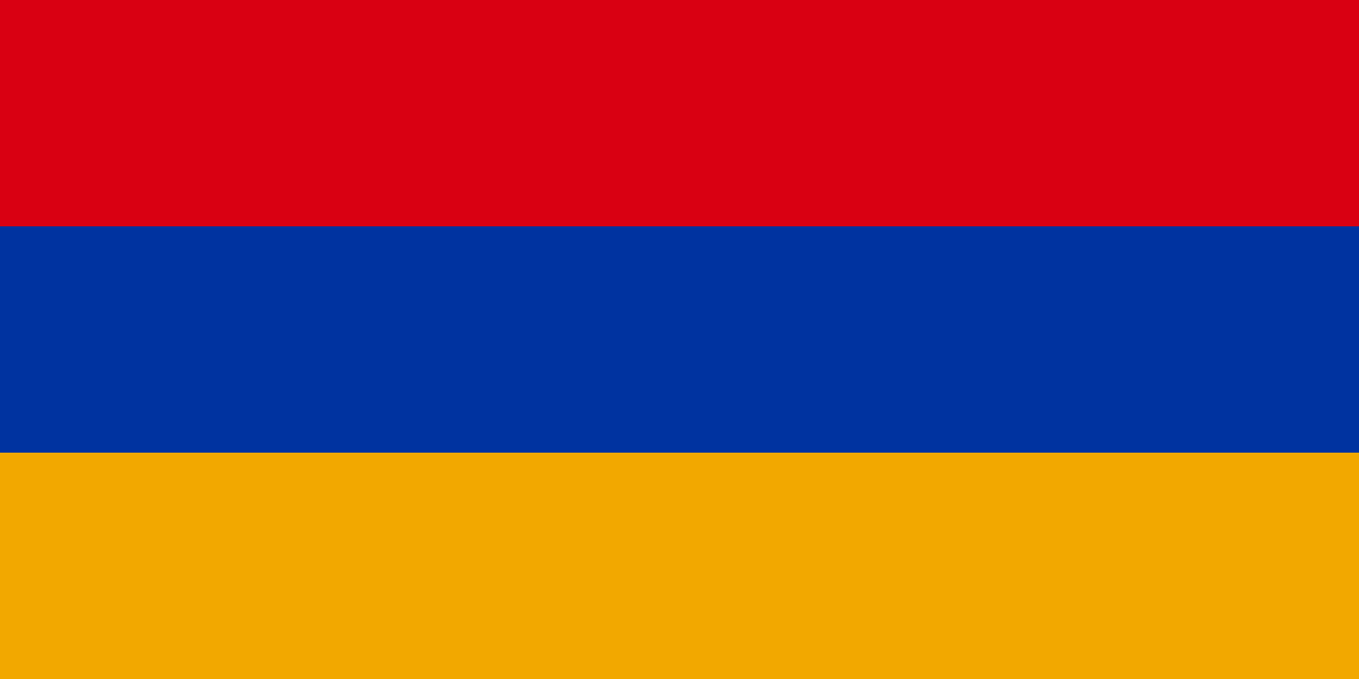
This is another combination of colors that just pops for me— it’s not quite as striking as Estonia, but it ranks right up there. I think it’s the fact that the red is above the blue- for some reason that just makes both colors combine with the orange just perfectly. Very easy on the eye and stands out and then some.
The history of this flag is another one sandwiched between a long period of Soviet rule. It was first adopted on May 28th, 1918, and designed by Stepan Malkhasyants (another point in its favor— not many flags have a designated designer that’s actually confirmed)for the First Armenian Republic that enjoyed a brief period of independence after World War I (just like Estonia). The flag was then re-adopted after independence from the Soviets on August 24th, 1990. Some interesting facts about this flag:
The Republic of Artsakh also uses the same color configuration with an interesting variant on the Armenian tricolor. (For more background on the conflict over Nagorno-Karabakh, the Wiki-Page seems like a good place to start. If you want to go further down the rabbit hole for understanding the conflict, you’ll have to dig through the interwebs themselves.
Originally, the colors were meant to be red, blue, and yellow- a color combination that dated back to the Lusignan Period. Turns out they replaced the yellow with orange “because it merged better with the other two colors, presenting a more pleasing composition.”
The flag’s Wiki-Page doesn’t seem to have an official interpretation of the colors. It does say that the red stands for the Armenian highlands, the Armenian people’s continued struggle for survival, the maintenance of the Christian faith, and Armenia’s independence and freedom. Blue is for Armenia’s peaceful skies. Orange stands for the nation’s talent and hard work.
Gabon

There are a lot of legitimately amazing flags in Africa, but if I have one quibble with Africa is that the color schemes tend to be highly regionalized. The Pan-Arab colors of green-red-black are found in more North African/Maghrebi countries, while West Africa is highly influenced by the Pan-African combination of green-yellow-black. Thanks to France’s history in the region, you see a lot more vertical, French-style tricolors than horizontal ones, so the pure horizontal ones tend to stand out. And Gabon does.
The color combination is interesting. The only other country that comes close to it is Rwanda’s new flag and even then, the green is a darker shade of green and on the bottom and the bands aren’t equal in size either.
Also making it stand out: the proportions. I don’t usually pay attention to flag proportions, but per the flag’s Wiki page, its 3:4 ratio which is enshrined by law is only used by three other countries: the Democratic Republic of the Congo, Papua New Guinea, and San Marino.
What do the colors mean?
The yellow stands for the Equator which cuts across the country and also stands for the sun.
The green epitomizes the natural resources of Gabon as well as its extensive forests (lumber is a big part of the economy)
The blue represents the sea!
5. Sierra Leone
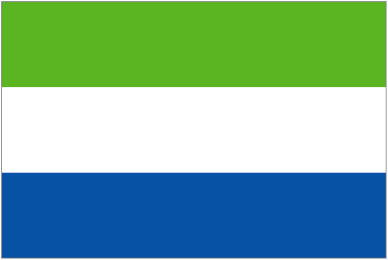
(Ack! Another flag that needs a border, so the white doesn’t get lost! Apologies if the image is lower quality than the others. Took some hunting to find the right one.)
Anyway: Sierra Leone! I just love the color combination again- for West Africa, it’s pretty unique. It doesn’t fall into the red-green-yellow combination of so many other flags in the region. So, what does it all mean?
Green stands for the country’s natural resources, specifically agriculture and its mountains.
The white is for ‘unity and justice’
The blue stands for the “natural harbor” of Freetown, the capital. AS well as the hope of ‘contributing to world peace’ through its usage.
It’s very similar to the flag of Galapagos Province, Ecuador as well as the Shannon-Erne Waterway in Ireland. (Also, if you’re interested in Flag of Convenience rules and controversies, Sierra Leone’s flag is used quite a bit by foreign merchant vessels.)
I feel like tricolors are easily overlooked in the wide world of flags. They’re not the most exciting flags out there in the world and as a design feature, whether they are horizontal or vertical, they’re pretty common as well. But, just because they’re plentiful in the world, doesn’t mean we should overlook the standout flags amongst their number either.
We should learn more South American history and less European history in schools- for sure, it would help us to understand our neighbors better, but it might lead to better overall policy-making as well. Plus there are some giants of history that deserve more recognition than they get in the general education system up here. Bolivar, Miranda, San Martin, Sucre and my all-time favorite, the liberator of Chile: Bernardo O’Higgins. There’s a really great one-volume history detailing all of this on my bookshelf, but of course, I can’t find a link on Amazon for it.