

Utah's (Potential) New Flag
Utah's (Potential) New Flag
Let's talk about the semi-finalists...

Utah is in the process of getting a new state flag! Honestly, more states should do this, because I think, as a whole, states (and certainly more than a few cities) could stand to up their vexillological game. I’m not sure how long the process is going to take in Utah— I think they’re aiming to have a final recommendation to their legislature fairly soon here, but they released 19 semi-final choices, which can be seen here— but for the sake of space, I’m just going to talk about five of my favorites.
1.
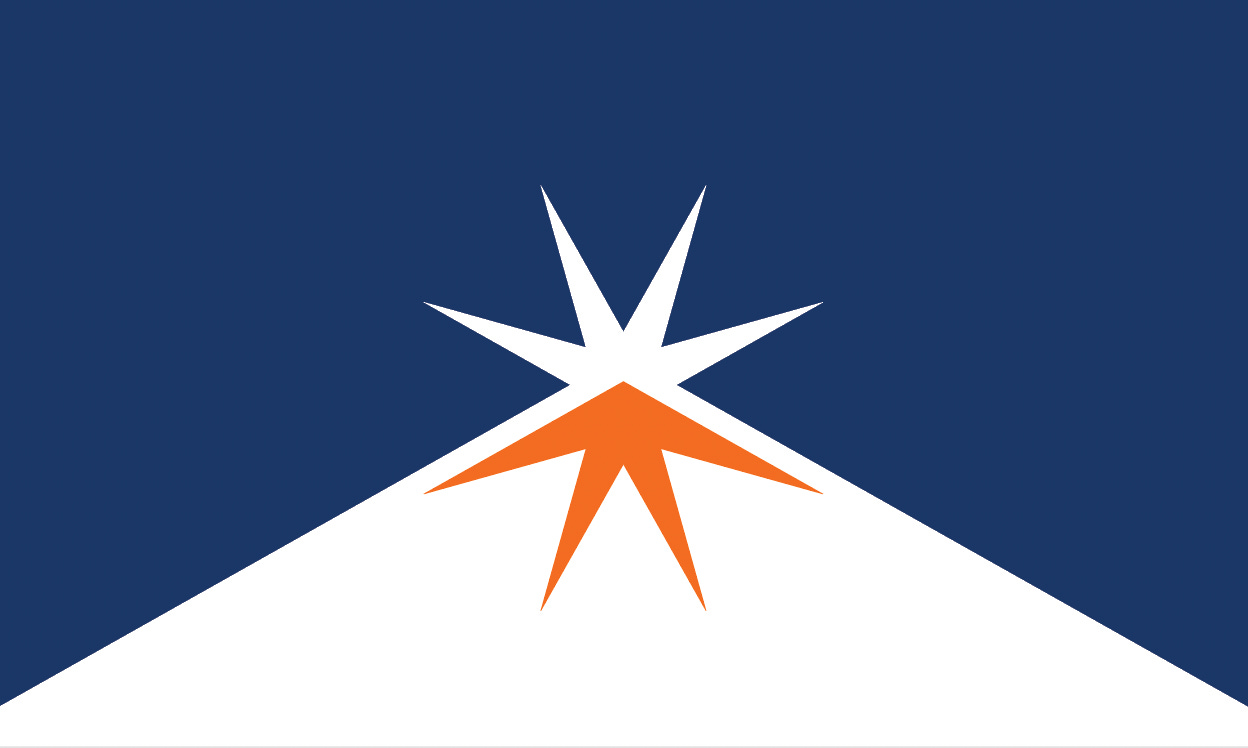
Per the website, the flag description:
The summit of the mountain peak meets the North Star, representing accomplishment as a people. The orange nods to the red rocks of Southern Utah and the eight points represent the state’s Tribal Nations.
What do I love about this? Honestly, it’s the simplicity— there are a few other designs that really get down to this level of simplicity, but they tend to move away (in my opinion) from being unique to Utah or tread a little too close to ‘Fly Utah Air Today!’ territory, which isn’t what you want.
The orange seems pretty unique for state flags and it’s a nice pop of color. The Star is great. The mountain peak works. It all works really, really well together. Plus- it’s simple! Anyone could draw that!
2.
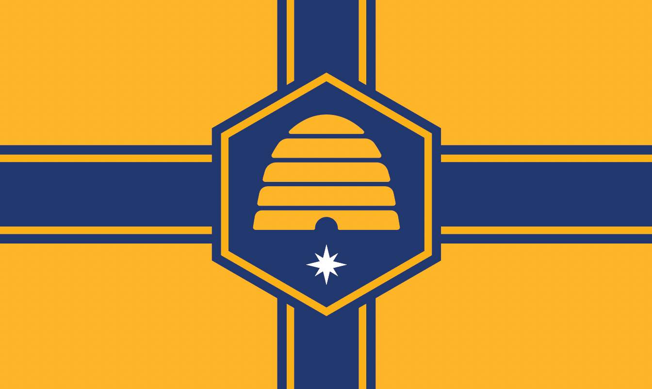
Per the website, the flag description:
A design shows the Crossroads of the West theme, which meets in the center where the beehive and hexagon represent all communities in Utah, industry, and prosperity. The star represents Utah’s statehood and guiding light with eight points representing the eight Tribal Nations. Blue represents tradition, power, justice, and knowledge.
What do I like about this flag? I know it’s not specifically named as a Cross of St. George, but I like that design. I like Nordic Crosses too (and if Minnesota wants to take a whack of redesigning theirs, I’d love to see a Nordic Cross for the Medium White North). But we need more crosses in flag design, especially state flag design. It’s a classic element that fits in perfectly with the idea of the theme.
Utah is the Beehive State, so I love that they’ve got a beehive right at the heart of this design. The colors pop. I love, love, love this. Could be my favorite of the bunch and would instantly vault Utah into the upper tier of state flags.
3.
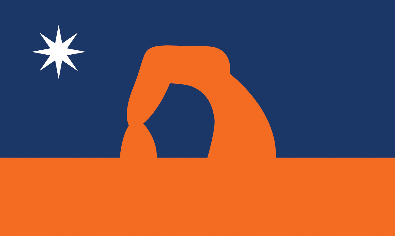
Per the website, the flag description:
Delicate Arch symbolizes our state’s celebrated and unique geological features. Orange is for Southern Utah’s red rocks, while the color also represents strength. Blue signals our skies, tradition, and freedom. The white star is a guiding light, while the eight points represent Utah’s eight tribal nations.
What do I like about this flag? The orange of it all! I’m not sure how I feel about it in combination with the dark blue— I think if you went with a sky blue, it might make this pop out a little more, but at the same time, I think the orange contrasts with the shade of blue quite nicely as well. (Very evocative of the landscape, if you’ve ever been to southern Utah, so it’s a good design choice to put that front and center.)
Also: I am loving the use of the eight-pointed star to represent Utah’s tribal nations. It appears throughout a lot of designs in the semi-finalist group- plus, eight-pointed stars rule.
4.

Per the website, the flag description:
Blue background represents tradition and knowledge. The sego lily, the state flower, has white petals representing snow and truth. The golden guiding star represents prosperity, faith, and happiness. The eight points represent the eight tribal nations that share the land with our state.
What do I like about this flag? The simplicity of it. Plus, the flower looks cool as well. But the simplicity really sells it. (Plus, if you get another state to go in the flower direction it could officially constitute a trend, given Mississippi’s redesign.)
Simple. Easy to draw. Few colors. Is it a bit boring? Maybe? But it’s also not an infamous ‘Seal On A Bedsheet’, so that’s an improvement!
5.
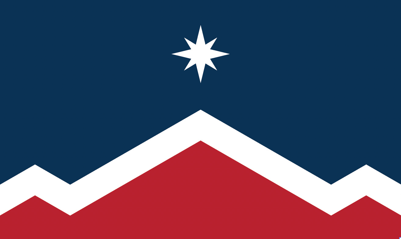
Per the website, the flag description:
The design’s shapes represent Utah’s mountain ranges. Red is for red rocks and perseverance. White for the snowy peaks of Northern Utah. Blue for our dark skies as well as tradition and knowledge. The mountain peaks are the tallest and they reach the guiding star as a symbol of hard work and accomplishment. Eight points on the star represent Utah’s eight tribal nations.
What do I love about this flag? The symmetry of it, actually. It’s simple, it’s evocative- with nods to the landscape and an excellent-looking eight-pointed star drawing the eye nicely to the center of the flag. The color combination isn’t perhaps the most original I’ve ever seen, but it’s hard to argue with red, white, and blue.
~~~
Utah has a ton of fantastic options to choose from and I can’t wait to see what the final one ends up being!