

The Best of Court Design 2024
The Best of Court Design 2024
In which I reveal the depths of my nerdery/problem

Yes, friends, readers, and random people on the internet, a new year is upon us and that means I spent basketball season not only watching the hoops but examining a great deal of the court designs that they play the game on. This year it was the pros that got me started well before the college season had even kicked off thanks to the colorful and eye-popping courts the NBA used for the In-Season Tournament.
I’m going to include images where I can and ideally, I’ll figure out how to embed some actual footage so you all can see what I base these impressions on- but if I can’t do that, I’ll link to the original tweet where I put down my first impressions, so y’all can see my receipts.
If you’re interested in last year’s edition, here’s a link to that: The Best of Court Design 2023.
And once more, I do apologize. I recognize that I have a problem when it comes to nerding out over court design and now you get to enjoy another year of it!
As always, all these categories are presented in no particular order- they’re more or less arbitrarily set by me and reflect just basically how I sorted them all out. So, without further ado, here’s The Best of Court Design 2024!
Best In Show
It was the NBA’s In-Season Tournament that caught my eye and started me down this year’s rabbit hole. I did like that every court designed for the tournament shared common design elements and a lot of them feature on this year’s list in various places but two of them made it to this category along with Oregon State.
The Philadelphia 76ers (In-Season Tournament Court)
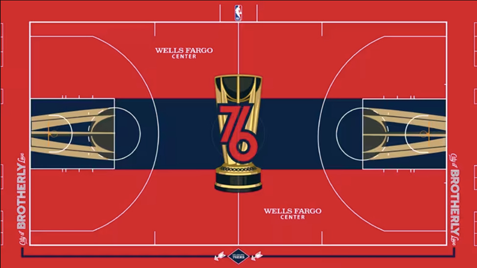
Some of the design choices for these courts worked and some did not, but this one really stuck out to me because I felt like the navy/royal blue really offset what seems like a disconcerting amount of the color red. You can’t argue with that logo either: it tells you exactly who the team is and dominates the center court without overwhelming it. There were a lot of very red courts for the In-Season Tournament and of all of them, this one was probably my favorite and arguably, worked the best.

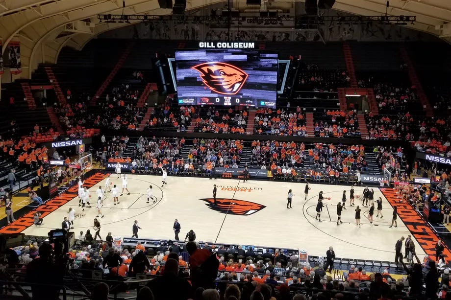
I will be 100% honest with y’all: I have never set foot in the state of Oregon, but I will always and forever be an Oregon State fan. The reasons are probably too numerous to list here, but I loved their Elite 8 run in the Women’s Tournament this year and their basketball court is sharp as hell. The orange on black at the endline is perfect. The angry, fierce-looking beave is perfectly positioned in center court. The court name and signature above that is also perfectly centered. Everything is sharp and perfectly aligned and I love the lighter shade of wood as well because it makes the orange pop that much more.

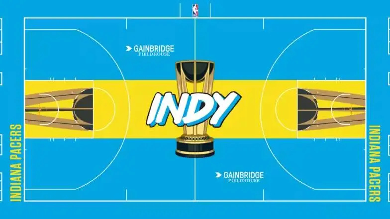
If you grew up in the 1990s, you remember when neon markers arrived in your elementary school. Suddenly there were colors like ‘magenta’ and ‘electric blue’ and ‘neon yellow’ and they were all awesome. I don’t know if the Pacers were looking to lean into a 90s vibe, but they managed to capture the essence of a decade and I absolutely loved it.
Best State Outlines
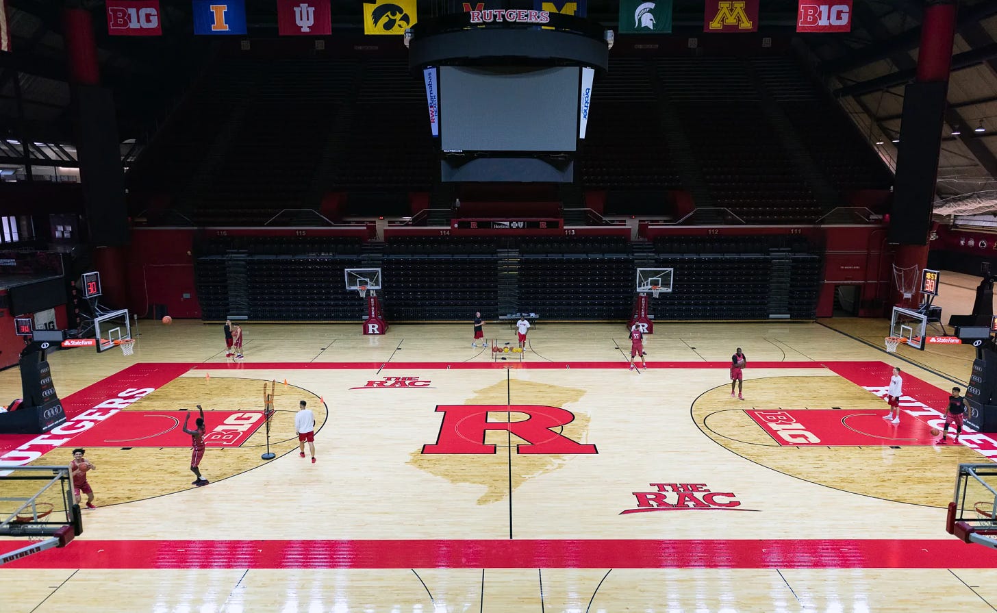
I love a good state outline on a basketball court but some states don’t lend themselves to a basketball court at all. Happily for Rutgers, New Jersey is not one of those. It’s a wee bit asymmetrical over the center line of the court, but not in such a way that draws attention- the big block ‘R’ in the center court also helps with that. It’s simple and if you wanted to, you could add a star or some subtle marking on the map to indicate the location of Piscataway, but I also don’t think it’s necessary either. It works just fine without it.

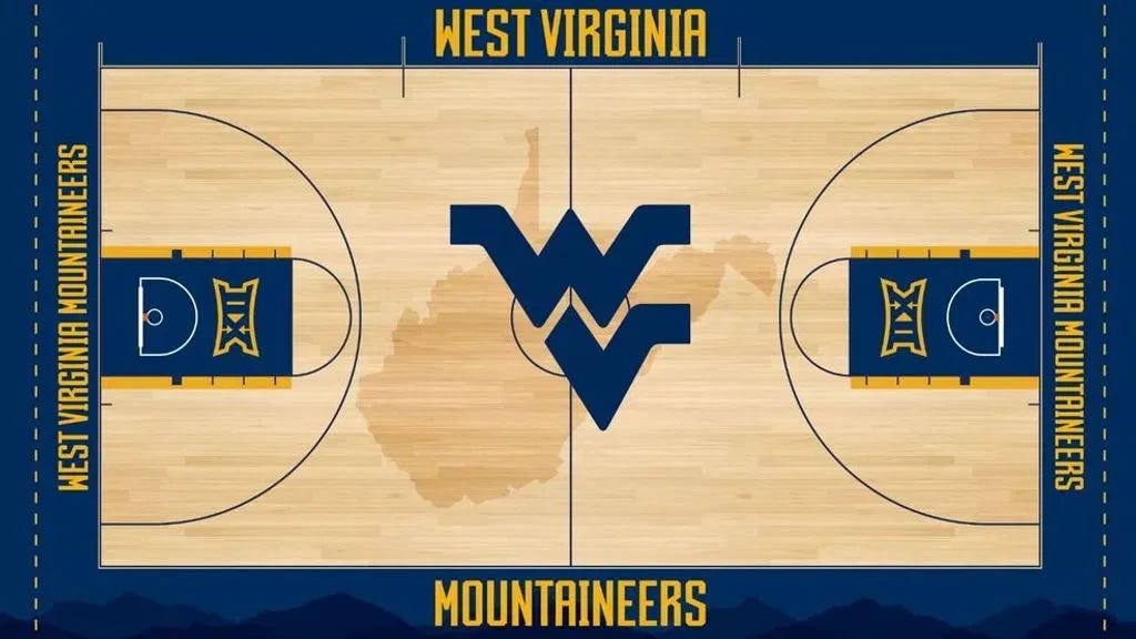
See how I said that some state outlines just don’t work that well for basketball courts? West Virginia- by itself- would be an asymmetrical nightmare. Instead, you have a great color scheme (love the blue/gold combo here) and the ‘WV’ logo distracts you enough from the asymmetry of the state outline. But I think the most brilliant part of all of this is that the ‘V’ is shaped in such a way that it resembles the outline of the state as well. (I’m assuming this is by design.) Either way, another great example of how some even though some state outlines don’t lend themselves well to basketball courts if you have the right design elements to go with it, it can pop.
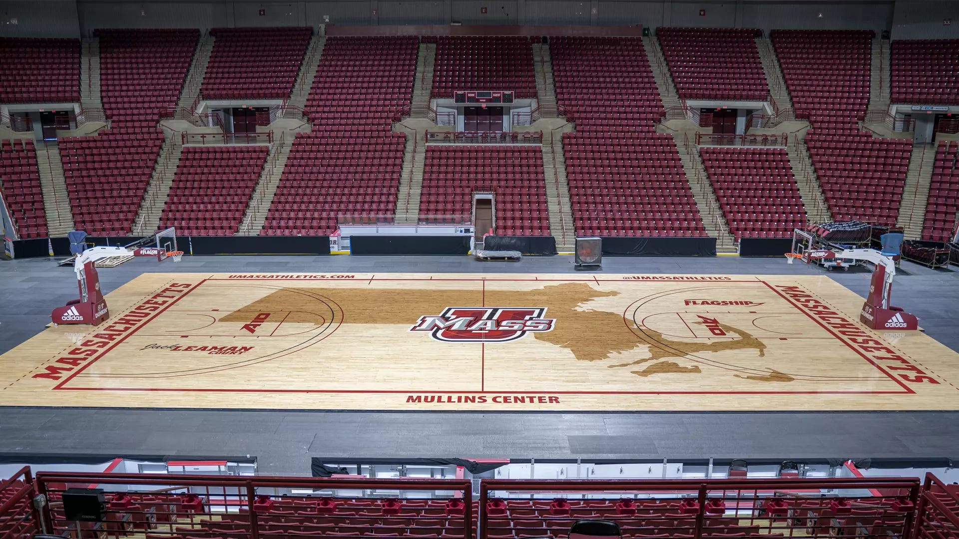
Honestly, this one surprised me the most. Of all the 50 states in the union to feature on a basketball court, Massachusetts is probably the one I least expected to see. And you know what’s crazy about this design? It works. They even throw in Nantucket and Martha’s Vineyard as well and it’s a little bit of a stretch, but the U-MASS logo roughly corresponds to where Amherst is in Massachusetts itself. I think this one works because of the shape of the state- because I think I would find that distracting myself, but then again I’m a huge geography nerd and not that good at playing basketball to begin with. (It would be legit interesting to talk to players and see if the court designs can be a distraction when playing. I’d imagine their vantage point is pretty different from spectators and viewers on the television.)
Best Big Ass Letters & Logos
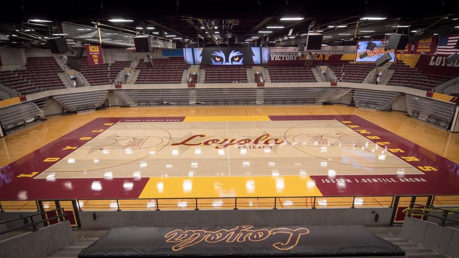
HOT DAMN I LOVE THIS COURT! The colors are awesome, the script for ‘Loyola’ is perfect and just flows across the court and they just tuck ‘Chicago’ right under the ‘-ola’ in ‘Loyola’ and it’s just.. *Chef’s Kiss* But that’s not all! In the background, you’ve got the stars and horizontal stripes of the flag of the City of Chicago. Beautiful script logo + iconic flag that nods perfectly to their hometown. Easily one of my favorite courts of the year!
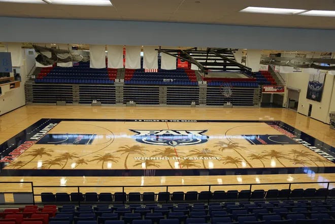
My first reaction to this court was, ‘What on earth do owls have in common with palm trees?’ As it turns out, quite a bit- as FAU’s owl is a burrowing owl which can be found down there. Owls are cool- so I don’t know how one can improve upon that simple statement alone. Owls are cool- even on a basketball court.

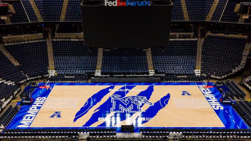
I’m going to go out on a limb and guess that the center of this court is meant to be claws! Like slash, the tigers have just disemboweled you with their basketball prowess and you will bleed to death in a jungle somewhere. It could also be tiger stripes. I’m less convinced of that because of the jagged nature of the lines on center court. But whatever it is: this is a badass-looking court. The attention is right where it should be on: on the big slashing claw marks/tiger stripes— the block ‘M’ impressively enough doesn’t get lost in all the blue either. The end lines have tigerstripes worked into them as well and the American Logo is well placed and doesn’t distract the eye either. This one is striking and badass. Loved it.
Best of the Pros
Spurs: The thing with Pro Ball is that they change courts a lot- so rather than wasting my time trying to find the actual court in question, I’m just going to have you click this link so you can see for yourselves. Sometimes, simple works and works really, really well. Silver and black are awesome colors and complement each other nicely. There’s no mistaking the ‘Spur’ in center court for anything else and the Texas logos under the three-point line mark San Antonio on the map. Sometimes simple works. It sure does in San Antonio.
Jazz: I’m sure people have written whole articles on just what Utah has to do with Jazz, but for whatever reason, they’ve stuck with the name and this court featured a sharp-looking musical note and I couldn’t tell if it was the lights reflecting or a feature of the court itself, but there was some green iridescence in the lane under the basket that looked cool. As with San Antonio above, sometimes simple works.
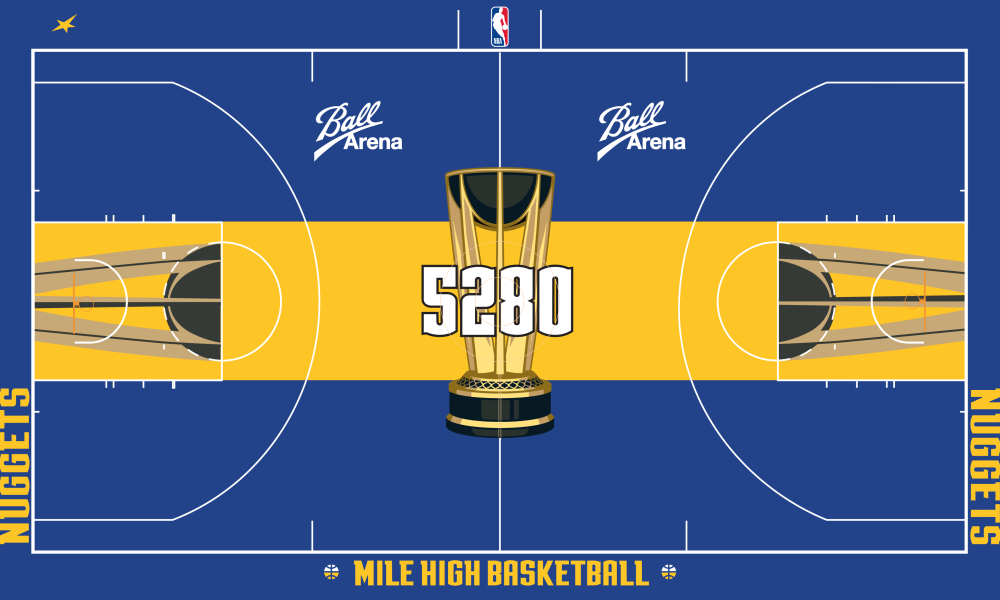
Nuggets (In Season Tournament Court):

I’m a bad basketball person because for some reason I thought this was the court for the Golden State Warriors. I have no idea how, as the 5,280 and ‘Mile High Basketball’ should have been dead giveaways that I was thinking of the wrong team. Weirdly, these are not colors that I usually associate with the Nuggets, but sure enough, they are listed on their wiki-page (well: midnight blue and sunshine yellow— I don’t know if this blue qualifies as midnight blue and it might have been a lot cooler if they had darkened it down a shade or two.) But either way, I love the contrast in colors. Neither color overwhelms the court and they work well together— it’s not, perhaps, the fanciest court I’ve seen, but it’s sharp.
Thoughts On The Rest
Could Be Better Than It Is: Stanford
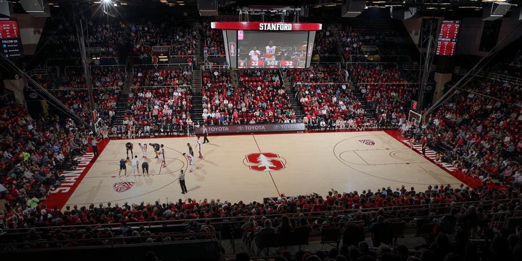
So, you kind of see this design choice in a lot of older Ivy League (Harvard and Yale both spring to mind) schools or at places like Duke. Duke has a low-key design and that works because… it’s Duke. You don’t need a crazy court, you’re in Cameron Indoor Arena and it’s… Duke. You kind of get a similar vibe here— the S and the tree are small and compact and it gives a very old-school feel. There’s nothing wrong with it, but there’s also an opportunity to lean into the Tree thing if you want to. Stanford’s athletic legacy being what it is, I can see the argument for not doing anything crazy, but Stanford now being in a conference wilderness and playing in the ACC could lead them to reconsider that in a few years if they feel the need to spice things up a bit. It’s good, it’s solid, but there’s room to do more here.
Props to the Hornets: for this incredible floor design and this striking design that made me instantly think of mint chocolate chip ice cream. I’m not sure what that has to do with either Charlotte or the Hornets, but it looked delicious.
Largely ‘Meh’: I’m so old I remember when Washington was the Bullets and not the Wizards— and the thing with Pros is that they usually trot out multiple courts over the seasons (at least that's what it seems like to me) so in fairness to the Wizards, they could have had some better-looking courts throughout their season. This one was fairly ‘meh’ and reflects their overall season record of 15-67 quite nicely I think.
In-Season Tournament Losers: For all the explosions of color you see throughout the In-Season Tournament Court designs, the Bucks went in the opposite direction and went a little more muted. You can argue about the pros and cons of that, but while the state outline was decent, the green was too washed out— they should have gone darker and I do feel they could have done better. In contrast, the Heat went with a surfeit of red paired with grey, which was a weird choice to me and not at all distinctive. The Bulls made much the same decision: lots of red, but didn’t stand out much.
Honorable Mentions: UNI almost made the big list up above (sorry, Panthers) and Eastern Washington- which could, admittedly, do better- but its logo at center court is sharp as hell- and Doane University also gets a nod.
Once again, for the second year running Substack is informing me that this post is ‘Too Long For Email’ which again only underscores the depths of my nerdery on this issue. If you have nominations for your favorite court, drop them in the comments and let me know- if you’ve made it to the end that is! And much like James Bond, I can say:
THE BEST OF COURT DESIGN WILL RETURN
Until then, friends!