

The Best of Court Design 2023
The Best of Court Design 2023
In which I unveil the depths of my nerdery/problem

If I was going to make a gigantic coffee table book and if I had the wherewithal and the photographic ability to do it, I would absolutely travel to every single college basketball arena and take a big-ass picture of their courts. I’m going to pin the blame for my fascination with basketball courts and their design on a very old Grantland article1 about the original Milwaukee Bucks court. Again, I don’t know why… I don’t mind watching basketball, but it’s not exactly appointment viewing for me. I loathed playing the sport in school and was never any good at it. To be quite frank, my kids could probably kick my ass in HORSE, PIG, or whatever other animal-related shooty-hoops game you could name.
I write all of this to underline that I am deeply aware that I have a problem, bordering on a mild obsession, and from January to early March it more or less took over my Twitter feed. (I followed Mid-Major Madness for a hot minute and then unfollowed them, like a coward, because my feed was immediately swamped with a tsunami of mid-major basketball highlights.)
Just looking at a shit ton of highlights and some basic design questions start popping out: where are the conference logos located? Are they consistent across the conference? How much corporate sponsorship is on the court and does it detract from the overall design of the court? How do we feel about skylines?
The design questions don’t even begin to touch on the mechanics of it all. Basketball courts are usually made from polished wood, usually, maple, and have different design specifications depending on what league/level of basketball you’re talking about. (Fun Fact about this year’s Final Four Courts- other than the fact the wood was sourced from Northern Michigan and made it a mill up there- the winning team can actually buy the court. And if they decline, it’ll be made available for sale as a used floor- at least according to the article I found.)
Did I do a comprehensive survey of every court in America this year? I did not. Basically, these are just the courts that floated by me on Twitter and made me go “Ooooh, that’s interesting.” Where possible, I’m going to link to my original Tweet/rating/thoughts and I’m going to include some pictures where I can so you all can see what I liked/didn’t like about these courts.
Basically, I’ve broken things down into some categories: Best In Show, Best State Outlines, Best Big Ass Letters, Best Big Ass Logos, and then some Reluctant Flowers (for Duke), a court that should be way better than it is (Kansas) and some other random design minutia at the end. So, without further ado:
Best In Show
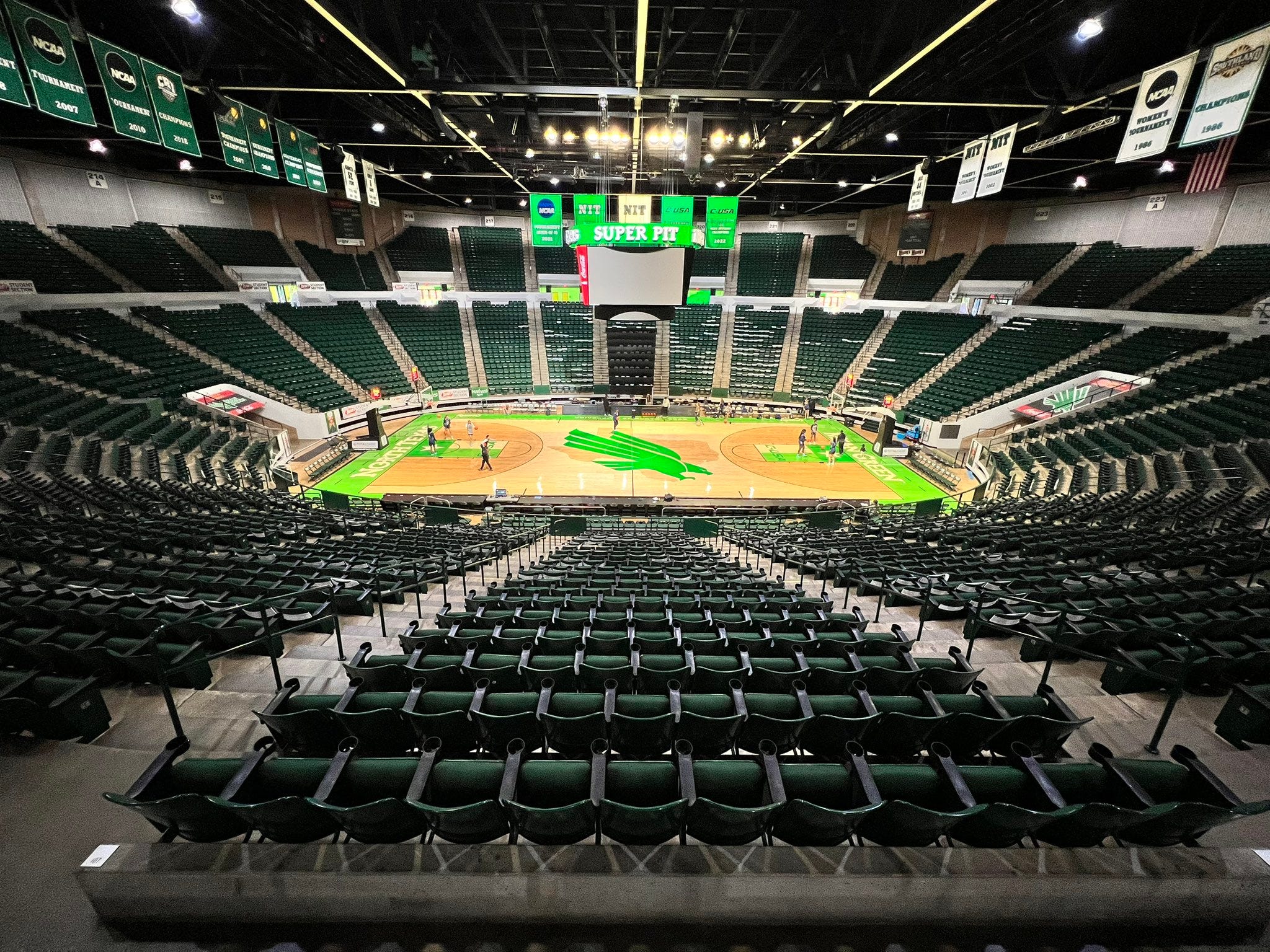
I am, thanks to a misspent youth attempting to play NCAA 2014 on a PlayStation 3, something of a Rice fan, so first of all, shout out to whoever is running the socials for Rice Women’s Basketball for it was they that tweeted this image and showed me this absolute banger of a court.
I love everything about this court. UNT is the Mean Green, so they checked that box and then some, color-wise. But the Texas state flags in green2 under the rim are a beautiful touch (plus if you squint really hard you can see the C-USA logo). That eagle is badass. I know Oral Roberts has a pretty solid eagle going for their court, but this eagle, holy shit. Just grabs your attention immediately. And we’ve got some overlap with the state outline category because the eagle is flying over the outline of Texas.
Someday, the Good Brand is going to launch UNT and undoubtedly significant amounts of my money will once again flow into their coffers because of that badass eagle. My original rating proclaimed: PERFECT. 100/10 NO NOTES. I see no reason to change that.
Mizzou
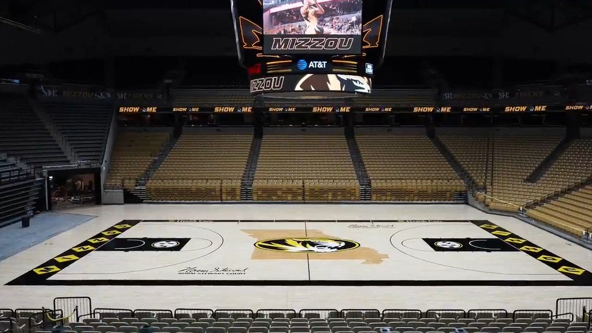
I actually ended up taking two really solid looks at Mizzou- one at a larger, actual television screen when they played Texas A&M and another at some highlights filmed on a phone filming a television screen. (So the quality was, as you can imagine, super high.) I like this court for a number of reasons- first of all, the design is super clean. It’s not cluttered with corporate sponsorships or extra words. Each design element works and Mizzou should give itself a ton of props for placing its corporate branding so well- it’s right along the boundaries of the court and if you squint really hard at the picture, you can see it. I am definitely one of those crusty old people that don’t like corporate sponsorship slapped on damn things but I acknowledge it’s an inevitability in the days we live in, so how you do it matters more to me.
Mizzou does it really, really well. Not only is the placement excellent, but the color scheme matches the school’s colors of old gold and black so it’s not a jarring design element at all.
Another excellent thing about this court: is its name of it! I love a good signature right on a court and although I didn’t know who Norm Stewart was, I feel like they pay tribute to his long tenure at the school admirably with his actual signature on the court itself.
Finally, I love the contrast between the white shade of the wood and the black and old gold color scheme. It makes the black pop. I still haven’t found a good explanation for the whole M-I-Z-Z-O-U in diamonds on either end of the court, but it’s distinctive as hell and stands out. While the state outline did bother me because it’s not centered, the Tiger logo is and it fits nicely over the state outline as well.
All in all, one of my favorite courts this year.
College of Charleston
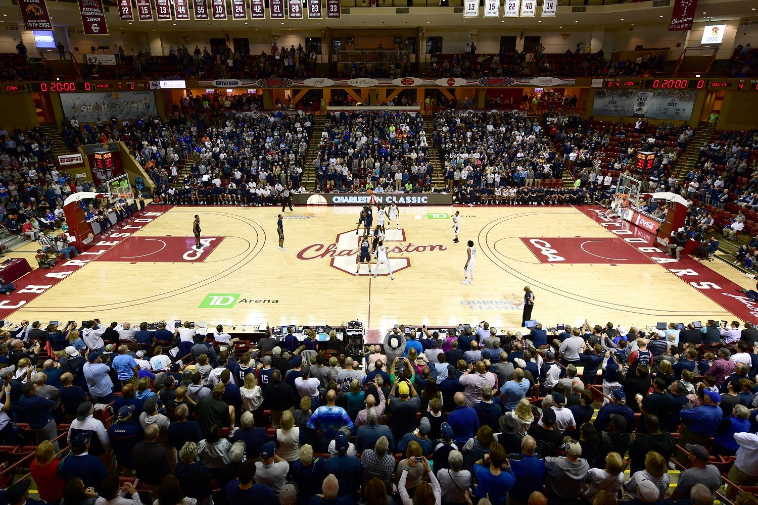
Look, this one is really simple: it’s the script for me. That script at an angle over the big block letter ‘C’ is just perfect. Sure, we can talk about how the corporate sponsorship doesn’t match the color scheme of the school (seriously, TD Ameritrade, you can’t have a logo in maroon just once?) and in this day and age, do we need two three-point lines? So it’s not perfect, but… that script is. There are a lot of courts that feature what I’m calling ‘Big Ass Letters’ and this one elevates above the pack to just be a really solid and excellent court design.
This picture might be slightly out of date because if you look at the footage in my original retweet, you’ll see that there’s only one three-point line and they have done the awesome thing and slapped a signature on a court (I’m guessing John Kresse?) which makes it look even better and from a television perspective that block letter ‘C’ and the script looks even better- so much better, that I’m going to ignore the clashed green of the TD Arena. (I am begging corporations, please, make your logos match the school colors?)
Plus, the Cougars had a really good season this year and finished 31-4, 16-2 in the conference, and then had the misfortune of catching eventual National Runner-Up San Diego State in the First Round, but even then, they went down 57-63 to SDSU, so it’s not like they ran into a buzzsaw.
Best State Outlines

This is the best quality and most current picture of Coastal Carolina’s court that I could find- the angle is not great, but if you click on the link above to my original retweet, you’ll see it in all its glory.
It’s beautiful. The state outline is a definite ‘thing’ in court design and some states work better than others some states are just not meant to be on a basketball court, but if you’re going to do it, this is a textbook example of how.
First, the color scheme: teal and bronze are unique right off the bat, so you’re already standing out there. But, follow that up with corporate branding that matches your color scheme and I’m giving you points for that. The way they work the colors into the conference logo plus the additional sunburst on the upper half of the SBC logo is just excellent stuff all around.
Second, the logo/state outline combo: Chauncey the Chanticleer fits perfectly into the outline of South Carolina. Not every school is going to be able to make that work with their state outline, for obvious reasons but Coastal can and that brings us to the piece de resistance:
Third (and finally) is the star: You can see it in the picture above and a little bit better in the footage retweeted, but that star represents the approximate location of Coastal within the state of South Carolina. It’s a small, subtle, touch and I absolutely love it.
Honorable Mentions: Ohio State, Indiana, Arkansas, Mizzou, UNC-Chapel Hill
Do Better, Friends:
Texas State: True story, I had to do a double take because I didn’t notice the state outline on this court. Partially, I’m going to blame the quality of the footage/highlights- but in general, I think Texas State can do a lot better. They’ve got a truly badass-looking mascot (they’re the wildcats) that’s just nowhere to be found. In general, they deserve more than TXST on their court.
Nevada: I get some of this- they’re the silver state, so that makes sense, but on the court, it just looks grey. Plus, they’re the Wolf Pack, so I think that’s a missed opportunity from a design perspective. I would make the state outline more subtle and massively upsize the wolf’s head logo. Or make the court silver or something, because this just doesn’t work for me at all.
Best Big Ass Letters
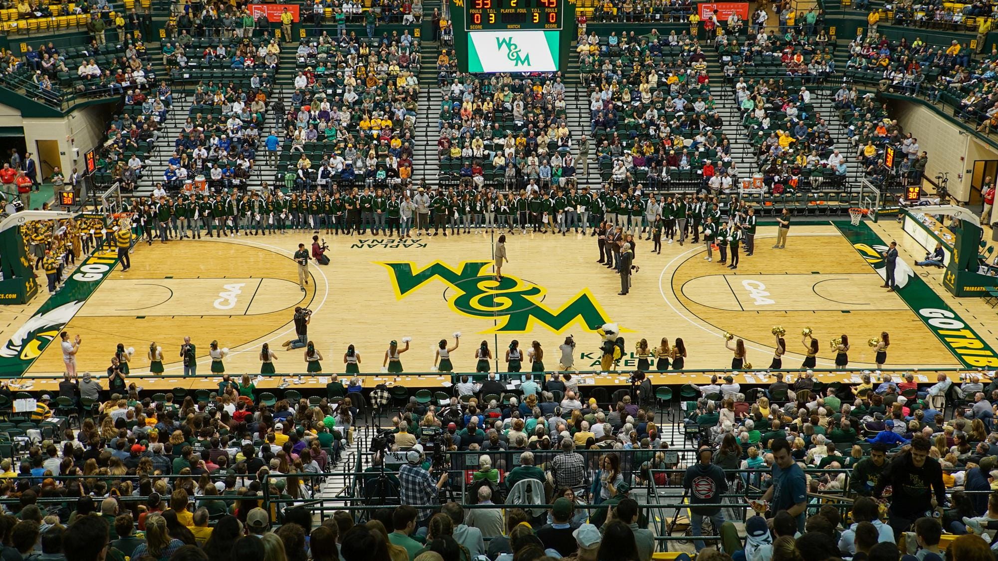
It’s the ampersand for me, I’m sorry, but it’s perfect. I love the font, I love the ampersand, I love the way it’s outlined in gold- but also, you have to respect the boundaries of the court too- the eagle with the GO TRIBE and the way they flipped the image so it’s the opposite side at the other end of the court? It’s just… *chef’s kiss* perfect! Can’t beat this one, that’s for sure- though full credit to Duquense, they came darn close, but they just didn’t have the ampersand.
Honorable Mentions: Utah State, Marshall, College of Charleston, Duquense, UCR
Do Better, Friends:
Harvard: I was curiously underwhelmed by this court— you can tell by the arena that it’s going to be an old school arena that has to have some history behind it and while the white wood sets off the Crimson quite nicely (in both words and color), the H in the center court is decided ‘meh’. I know Ivy League don’t do sports the way the rest of the country does, but… it’s Harvard. I should be a little impressed, right?
Portland State: This is another logo that lacks a certain ‘je ne sais quoi’… the color of the wood does make the forest green pop though, I’ll give it that. But, their mascot is a Viking, so I feel like switching out Big Ass Letters for an actual Viking could up the cool factor here.
Best Big Ass Logos
I could not find a good current picture of this court, so you can click the link and see for yourself what drew me to it. I want to emphasize that this is a very crowded category for me and you could easily make the case for ORU to be bumped up to the Big-Ass Letters category, but I’m going to keep it here because the letters are nothing without that golden eagle.
It’s crisp and sharp, dominates the court and, as all mascots should, looks incredibly badass. Bonus: EXPECT A MIRACLE on the baseline of the court which works whether you’re cynical about Oral Roberts University or actually appreciate the nature of its mission.
Honorable Mentions: Iowa3, Sparty, Creighton, North Texas, Merrimack, Northeastern, Wazzu
Do Better, Friends:
Boise State and Kansas State: I’m going to put these together because they suffer from the same problem— I love the fonts- the K-State Font especially is excellent. But the Wildcat needs to be BIGGER- make that sucker more badass. And while the white eyes on the Bronco do lend it an air of menace that works nicely, it should also be BIGGER. Dominate that court, friends. You’ve got the logos to do it.
Thoughts On The Rest
Reluctant Flowers: Duke
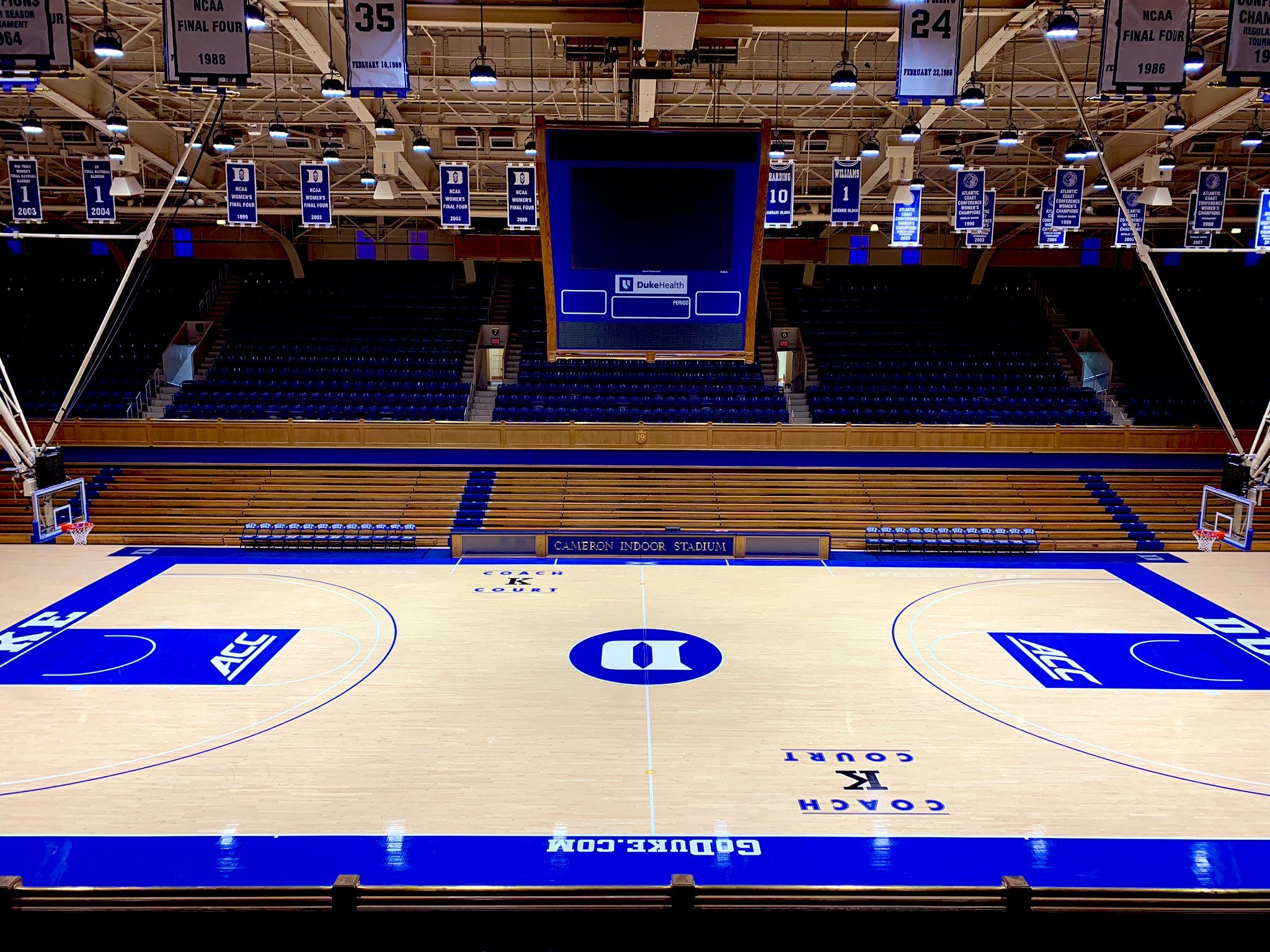
Like all college basketball fans who didn’t graduate from Duke, I am often reluctant to give them their flowers, but here, we have to give them all the reluctant flowers. This is so clean, design-wise, and really, it’s the perfect court for the blue blood. Don’t need to get crazy with our court design because we’re Duke, you’re in Cameron Indoor Arena and odds are, you probably not going to have the best of times.
Should Be Way Better Than It Is: Kansas
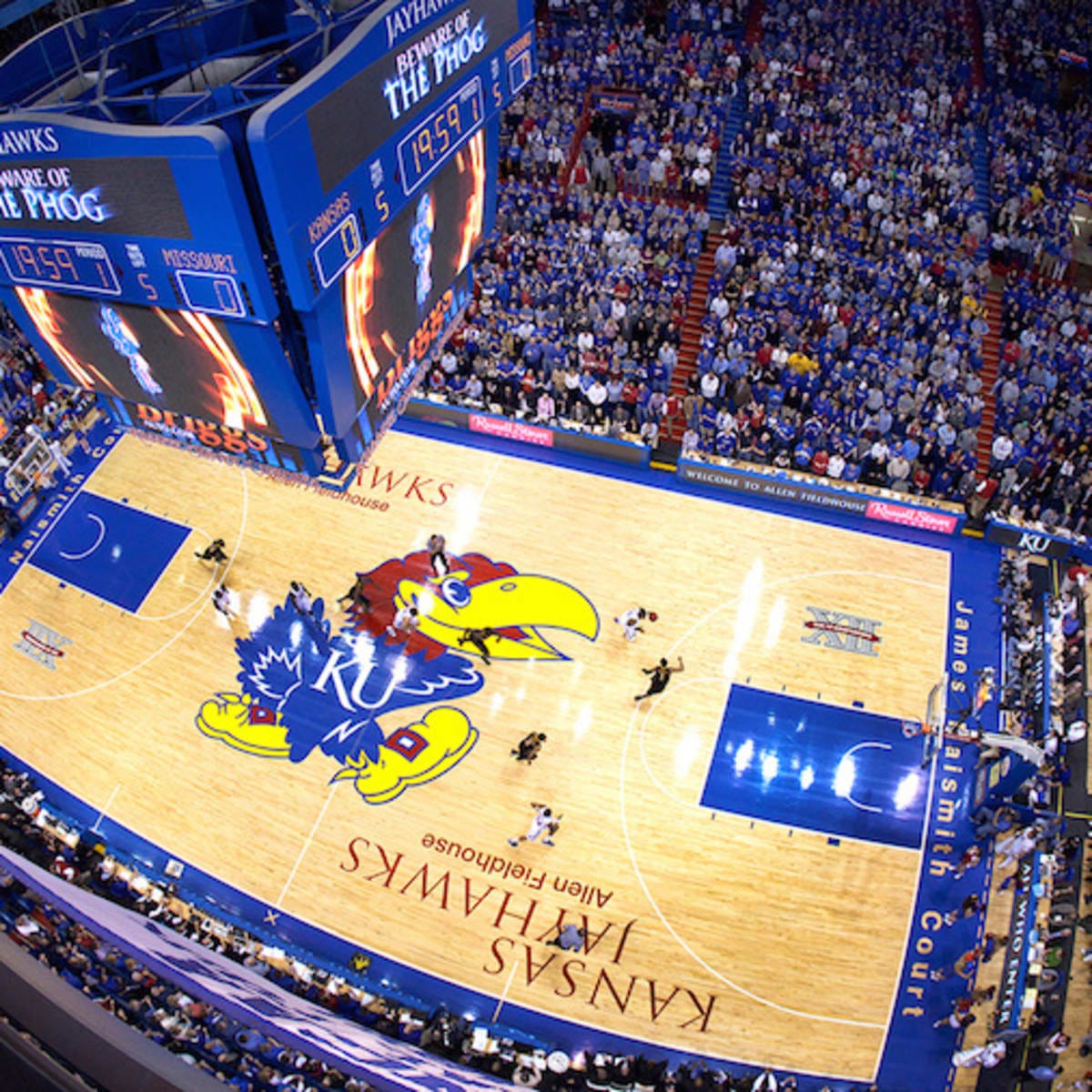
You go from Duke that knows it’s Duke and thus doesn’t try too hard to this where Kansas is trying way too hard. I think, perhaps, the gigantic bird might give you a clue as to the nature of the mascot, but apparently, to remind everyone they felt the need to write ‘Kansas Jayhawks’ on the court twice. In addition, if you didn’t know you were in Allen Fieldhouse, they’ve written that on the court twice as well. Plus the inconsistencies in the font usage drove me insane looking at this. ‘Kansas Jayhawks’ looks great and I can understand wanting to draw a contrast with ‘Allen Fieldhouse’ underneath but it’s unnecessary at best, decidedly ‘meh’ at worst. However, the font for James Naismith Court looks like the default font and is barely a step above Comic Sans. The inventor of the damn sports deserves a nicer font than that, Kansas.
Design Minutia: I’m still not sure how to feel about skylines. IUPUI is a good example of one, but Wazzu- their iconic logo aside also gets some flowers from me because as one of the most rural Division I schools one does not usually think of Pullman and skyline in the same sentence, so I give them props for showcasing the rolling hills of Palouse. My biggest question with skylines is how does it look on the opposite side of the court? It’s like The Upside Down from Stranger Things? Does it look odd? Does it matter at all?
Corporate sponsorship is also an inevitability in this day and age- but some schools do it better than others. Mizzou does an excellent job with it. Big bonus points if you make your corporate sponsorship match your color scheme, because when it doesn’t- and I’m not picking on Iowa State here, because they’re not the only ones where it doesn’t match- it really sticks out. (And don’t even get me started on conference tournaments- Arch Madness is excellent branding for a conference tournament and it’s ruined by slapping corporate sponsorship everywhere. Probably bugs me more than the new B1G Conference Tournament logos.
Also, Oregon isn’t anywhere on this list, because it’s not a design, it’s elevated itself to a work of art- but it is a great example of the potential of court design. As a viewer- whether in the arena or at home on television, you get the advantage of height, which lends perspective. I don’t know what it’s like on the court level and even more so trying to actually play the game on it. I would find courts like Oregon’s and TCU’s incredibly distracting if I was a player. Actual players themselves might be thoroughly unbothered by them.
I’ve already been advised by Substack that this post is ‘Too Long For Email’ which only underlines how deep a dive I took on Court Design this year. If you have nominations for your favorite court, drop them in the comments and let me know- assuming you’ve read all this way, that is! But if not, undoubtedly I will be back next year with the Best of Court Design 2024!
Until then, friends!4
I know it was an article, I swear it was— but apparently, they also turned into a 30 For 30 Shorts, that alas, I cannot find on the Interwebs- but don’t think I won’t try now and again, just for kicks. Also: god damn was Grantland an excellent sight. Pour one out for them.
True story, we went down to Texas to visit the wife’s relatives over Spring Break four years ago and I saw all these Texas flags in green and just assumed they were for St. Patrick’s Day. I was corrected immediately!
I would heartily endorse this proposal that was floating around the internet- or anything that works in a script ‘Iowa’ somewhere… I might also be inclined to invert the colors at the diagonals, so one half is a black stripe with white and gold letters and the other gold stripe with white and black letters, but either way, it would awesome.
No, I didn’t talk about my beloved Zags too much. I did see their court and the fonts are very nice, but I didn’t have a ‘BEST FONT’ category and it doesn’t work for logos or ‘BIG ASS LETTERS’ all that well either. Still love my ‘Zags though. Next year, boys!