

Top 5 New American Municipal Flags
Top 5 New American Municipal Flags
Picking the best of the rest of NAVA's 2022 Survey

I had a different plan for this post— but when news broke that NAVA (the North American Vexillological Association) had rated Cedar Rapids’ new flag as one of the 25 best new municipal flags in the country, I decided to take a peek at the results and while I knew that cities across the country had been busy upgrading their flags, I had no idea how busy they’d been.
We’re going to remove a few from consideration. I’ve covered the design process for Cedar Rapids (here and here- and I’d forgotten, but I took my limited graphic design skills out for a ride to work up my own proposal for Cedar Rapids) and we looked at the proposed flags for the city of Lincoln and way, way back in the day, I looked at Tulsa’s redesign process as well. So for the purposes of this list, we’re really looking at the ‘best of the rest’. (In no particular order, of course.)
Topeka, KS
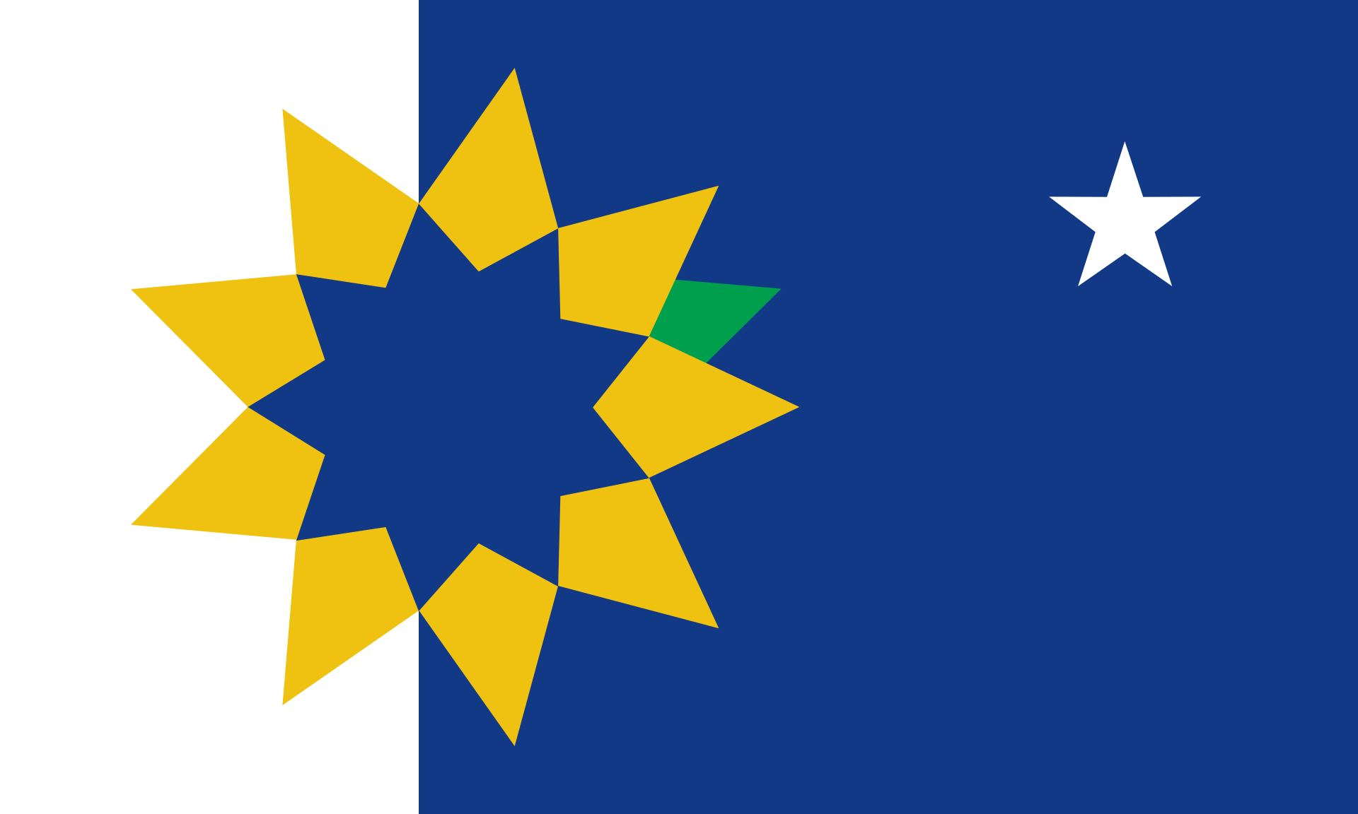
Adopted in 2019, the new flag replaces the old one, which was adopted in 1977 and designed by a local Boy Scout Group. (Also: fair play to Topeka, here, because in a veritable hurricane of really bad municipal flags, their old flag squarely falls into the category of: “not that bad”.) But anyway, what’s it all mean? Taken straight from the VisitTopeka.com webpage:
Gold: reflects the city’s nickname, ‘The Golden City’, given by the early settlers because of the beauty of the city’s sunlit rolling hills and autumn elms.
Green: represents the fertility of the Kaw Valley and corn, an important agricultural product of the region.
White: represents Topeka’s national historical significance as a community fighting for a more just society. White is a color often used to denote goodness, purity, and peace.
Blue: recognizes the Kansas state flag and symbolized the beautiful skies. Just as white often stands for purity and peace, blue stands for trust, stability, and tranquility- which our city has modeled in the face of adversity.
And then there are the symbols:
Sunflower: pay tribute to Topeka, the capital city of Kansas, the Sunflower State.
9 Petals on the Sunflower: represent the nine founders of the city.
Star: represents where Topeka is geographically and also denotes the city as the capital. A five-pointed star is commonly used to represent the capital of a geographic region on a map.
Green Arrow Pointing to the Star: this symbol represents both the statue atop the Kansas statehouse and the state motto. The green arrow points toward the star. That is symbolic of Ad Astra, the Native American who stands atop the statehouse building pointing his arrow toward the North Star. The flag, in paying tribute to Ad Astra, also pays homage to the Kansas motto, “Ad Astra Per Aspera,” which in Latin means, “To the stars through difficulty.” This motto speaks to Topeka’s birth through adversity during the civil war and the community’s significance in the fight for civil rights.
So, maybe you could argue that there’s almost too much symbolism packed into this flag. Perhaps. But, I like the simplicity of the design. Kansas is the Sunflower State, Topeka is the capital and if you were given fifty flags for fifty state capitals, you’d have an outside chance of guessing that’s Topeka, based on the design alone. I love how rooted in the history of the city and state the flag is and in general, it’s striking and I’m a fan of off-center elements that draw the eye and this sunflower certainly fits the bill. Overall: I’d say 9.5/10. Just about perfect.
Kingman, KS
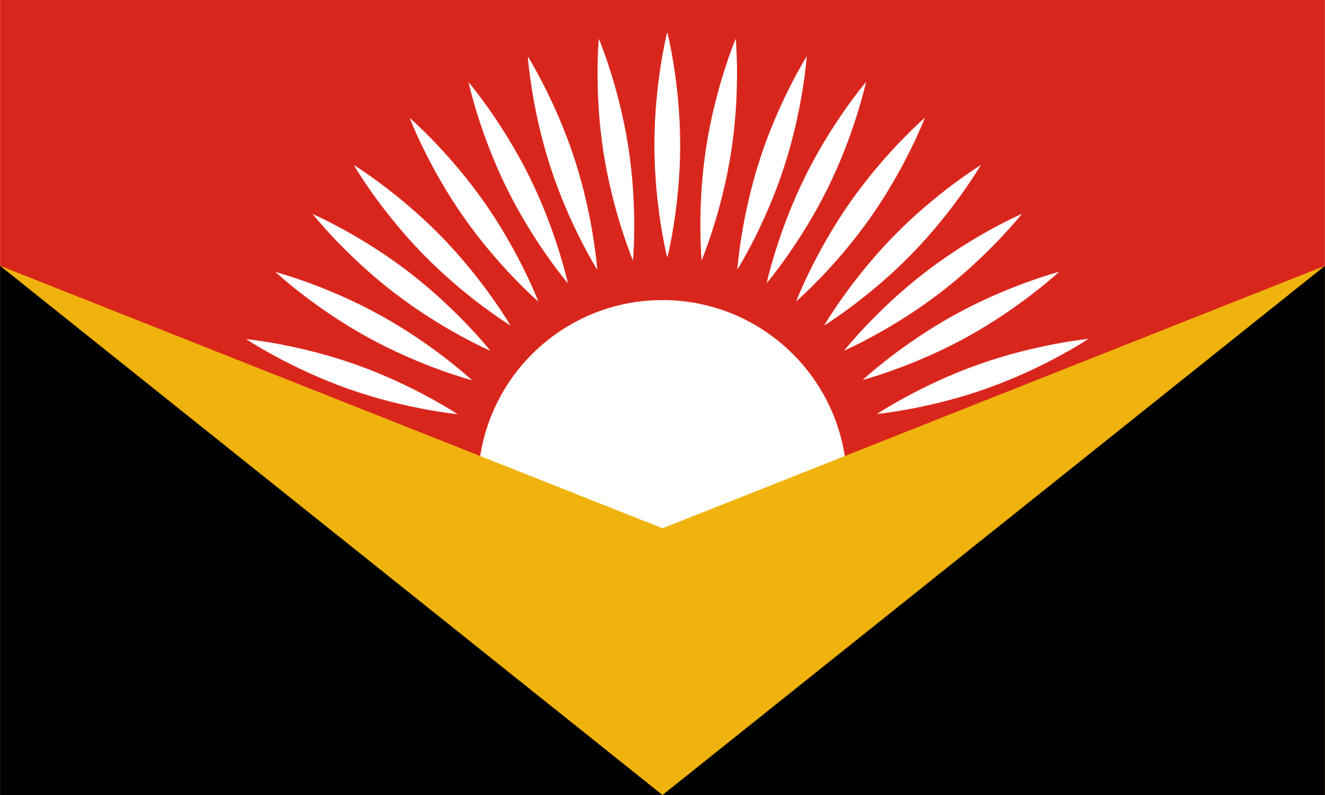
If, like me, your first question was: “Where the hell is Kingman, Kansas?” You probably aren’t alone, however, let me be the first to say that Kingman, Kansas: you have a boss-ass flag. Look at this beauty! It practically leaps off the screen at you and it’s instantly identifiable, the colors pop, and it’s vivid as hell— what’s not to love about this flag?
(Also, if you’re wondering: go to Wichita and head west on Highway 400 for about 45 miles or so, and you’ll get to Kingman.)
The flag description I found over on crwflags.com, but it cites a style guide from the Kingman County website as the source of its information. Here’s what I got:
The elements of the flag represent both the city and county of Kingman, Kansas. The gold chevron represents the Golden Valley of the Ninnescah. The white sun represents the prosperity and forward-thinking of the residents in each community in the Golden Valley, as well as the Sun Dance of the Kiowa tribue that historically inhabited the area. Red and black are the colors that are identified with the Unified Kiowa tribe, as well as being the colors of the county’s two school districts.
The color red symbolizes the boldness and courage of Kingman residents. The black color symbolizes strength and authority. The gold color represents the rich resources and agricultural heritage of the county. The white color symbolizes hope and aspirations for the future.
I have absolutely no nits to pick here. Overall: 10/10, I love this. Absolutely no notes.
Madison, Wisconsin
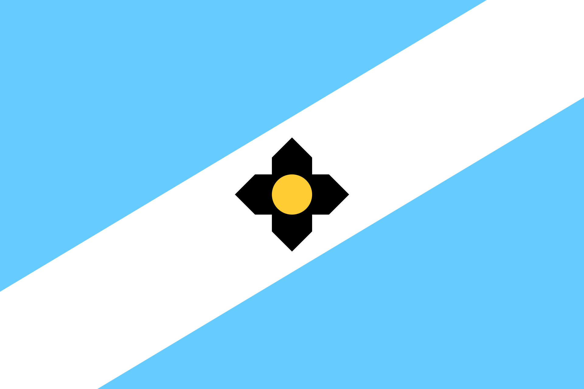
Here’s the thing: I would not call this particularly new. The original flag dates back to 1962 and overlaid on the cross was a Zia sun symbol, sacred to the Zia people of New Mexico. It seems like the original intention was the have some kind of Native American symbology so it was conceived of as more of a general ‘Indian sun symbol’ (that’s per the wiki page, not my verbiage there.)
It is a First Nations symbol. Weirdly, though, it’s just not used by any First Nations in the Wisconsin area. It’s very much a symbol of the First Nations of the Southwest.
So, props to Madison for having a solid municipal flag quite literally decades before anyone else did- but kudos again, for not re-inventing the wheel when a resurgence of the flag in 2015 led to people asking some pretty obvious questions like “what’s the Zia sun symbol doing on the flag of the capital city of Wisconsin?”
The original flag was designed by Rick and Dennis Stone (members of the Madison Scouts Drum and Bugle Corps) who did the design with their color guard instructor John Price. After the update was finalized and approved in July 2018, the Brothers (who were supportive of the changes to the flag) were presented with the first copy of the new flag, which I thought was a really nice touch.
The flag of Madison, Wisconsin, includes a sky blue background with a diagonal white stripes that goes from the bottom left corner to the top right which symbolized Lake Mendota, Lake Monona and the isthmus between them. At the center of the flag is a black cross, which symbolizes the four lakes (Mendota, Menona, Wingra and Waubesa) as well as the cross shape of the Wisconsin State Capitol. The gold circle in the middle represents the Wisconsin State Capitol’s dome.
You know I thought if you got all fifty flags of the state capitals together, you’d stand a decent chance of being able to guess Topeka’s. Add Madison to that list as well. It’s the one state capital I can think of that has an instantly recognizable geography to it. That diagonal stripe more or less is what the isthmus looks like and as a nice touch, that cross in the middle? It’s more or less the outline of the Wisconsin State Capital.
If the point of a flag is to represent a place? You can’t get much better than this one. If there’s a nit to pick, I might argue that while Topeka’s sunflower gives you an instant connection to Kansas- Madison lacks a similar connection to Wisconsin as a whole. But as nits go, I think that’s small potatoes. Overall: 8.5/10, good bordering on great. And an extra .5 for being decades ahead of the design curve.
Pocatello, ID
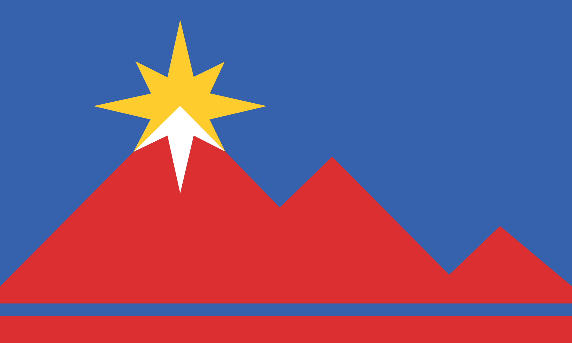
If there’s a municipal flag that might be responsible for starting off a design revolution for municipal flags, it might be Pocatello. Its old flag was named the worst city flag in North America in NAVA’s 2004 survey and it was called out by Roman Mars in his TED Talk about flag design in 2015. Needless to say that burst of infamy convinced the city: it was time to get a new flag (and they invited Roman Mars to come to their first meeting!)
This version of the flag (named ‘Mountains Left’) has been in use since 2017. Let’s find out what it all means (taken from the flag’s wiki page):
It includes three overlapping pink-red triangles, with the triangle on the left being the largest and the other triangles getting proportionally smaller. Together they represent the mountains of the nearby Sawtooth Range, specifically Scout Mountain, Kinport Peak and Chinese Peak. At the top of the biggest triangle is a yellow compass rose, formed from 8 triangular arms, that are arranged with alternating longer and shorter arms. The southern point and half of each of the southwestern and southeastern points are white, with the rest being yellow. The white portion of the rose is positioned to represent the snowy peak of the largest mountain.
The red triangles also represent industry, recreation and education. The compass rose symbolizes the role of the city as the transportation and trade hub for rail, road and air, as well as the past, present and future of the city. The yellow color represents the agricultural ties of the region and the prosperity of the city, while the white color references the snowy peaks of the mountains. The blue background symbolizes the sky and the blue stripe near the bottom of the flag symbolizes the Portneuf River. The design of the flag was meant to represent the history of indigenous people from the region. It conveys upward motion, signifying positive hope for the future.
You don’t like to take into account prior flags when looking at current ones, but there’s no doubt that Pocatello wins massive points for the ‘biggest possible upgrade’ here. It went from a late 90s hot mess to everything you could possibly want in a flag. It has relatively few colors, it’s easy to draw, it’s got a nice focal point with the compass rose and it’s got a nice sense of place with the use of the nearby mountains.
It’s striking. It’s vivid. It’s the one that started the apparent resurgence in municipal flag design that we’re living in today. (I mean, it’s the flag I’d pick. I’d be open to arguments.) Overall, I’d say 8.5/10. This flag pops, which is exactly what you want in a flag.
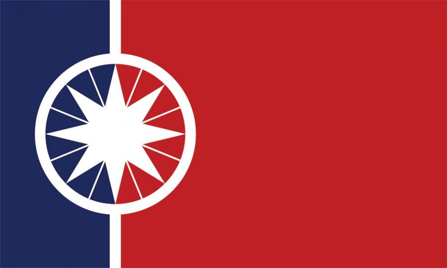
Norman, OK
Okay, true story: I was torn between this flag and the flag of Salem, Oregon but eventually, I just couldn’t get this one out of my head. So, Norman gets the nod. (I’d have to check, but I wonder if there’s a nexus of good flag design running down the Great Plains. Between Topeka, Kingman, and now Norman, I have to wonder.)
Norman’s flag gets its own place on the city’s website and it’s from there we get the meaning of the flag. First, the formal symbolism:
The emblem is inspired by our namesake, Abner Norman who first surveyed its land for development. It is taken from the central element of a circumferentor, or surveyor’s compass. A symbol of Norman’s steadfast pioneering spirit.
The compass rose itself has its origins in ancient meteorology and serves to symbolize Norman’s role as the home of the National Weather Center providing weather data for the entire nation as well as our leadership in meteorological research.
Then, The Eight Points (or “Winds”):
Additionally there is a great meaning in the eight pointed star as it appears in many different cultures across the globe. Most relevant to our region, the inscribed eight point star resembles the Native American hope symbol. Wherein the eight pointed star represents hope and guidance, the circle represents protection.
The central emblem is placed toward the hoist and rendered in white. The white represents omni potential and optimism as we moved forward in time crafting an inclusive community. A blue pale at the hoist represents the natural beauty around us, the waters and ecosystems of Lake Thunderbird, the Canadian river, and the blue sky above us. A red field represents the passion-for education, culture and community- that defines the residents of Norman.
I love the simplicity of this one. The compass rose/surveyor’s compass is off-center (love that) and it draws the eye perfectly. It doesn’t need colors or angles or excessive symbolism— it’s white, so it contrasts nicely between the red and the blue and it pops. While a lot of the other flags have more direct symbolism of the geographical place they represent, Norman doesn’t and I like that. You have to dig a little to find out what it all means and I like that. You can, of course, take it too far- but Norman doesn’t. It works. (Also: I would imagine given the proximity to the University of Oklahoma, the temptation to use crimson and cream might have been great. Kudos for leaning away from that.) Overall, I’d say a solid 8/10. Solid, simple, great symbolism.
If you follow the link at the top of the post to the NAVA Survey, you’ll see there are a ton of great municipal flags out there now. I’d take a look at them all, but that would be a very long post indeed, however, I’ve got to hand out some Honorable Mentions before I end this (already lengthy) post:
Salem, OR: the color combination is really unusual, love the star embedded in the cherry blossom.
Sioux Falls, SD: quite literally, an illustration of the falls that give the city its name. Can’t argue with this one.
Duluth, MN: There’s occasional chit-chat from the Medium White North that they might take a run at redesigning the State Flag. Duluth provides a powerful argument of what’s possible with flag design up there.
While my application for the City Council alas, was not accepted, one issue remains very obvious, in the face of all this excellent flag design. Iowa City needs to get in on this. Maybe, it’s time to start going to some meetings (ew, participation) and asking some questions to see about getting something started.