

Top 5 'Seals On A Bedsheet'
Top 5 'Seals On A Bedsheet'
A deep dive into the "best" of the so-called "worst"

So, as every good Vexillology nerd knows, the State flags of our dear United States leave something to be desired1. Some (Colorado, New Mexico) are better than others- but far too many are merely described as “Seals On A Bedsheet.”
NAVA (the North American Vexillological Association) has five principles for good flag design:
Keep It Simple. The flag should be so simple that a child can draw it from memory.
Use Meaningful Symbolism. The flag’s images, colors, or patterns should relate to what it symbolizes.
Use 2 or 3 Basic Colors. Limit the number of colors on the flag to three which contrast well and come from the standard color set.
No Lettering or Seals. Never use writing of any kind or an organization’s seal.
Be Distinctive or Be Related. Avoid duplicating other flags, but use similarities to show connections.
All of the flags in the list below violate at least one- if not more, of these precepts. And while flag nerds would probably love to hate on a lot of these, I’ve decided to celebrate them. I know right now there’s a push to get better, more distinctive municipal flags, but outside of Mississippi’s new flag, there doesn’t (as of yet) seem to be a lot of momentum towards designing better state flags.
So, until there is, we’re probably going to be stuck with a lot of these bad boys, so why not take a Deep Dive into the “best” of the so-called “worst.”
Oregon
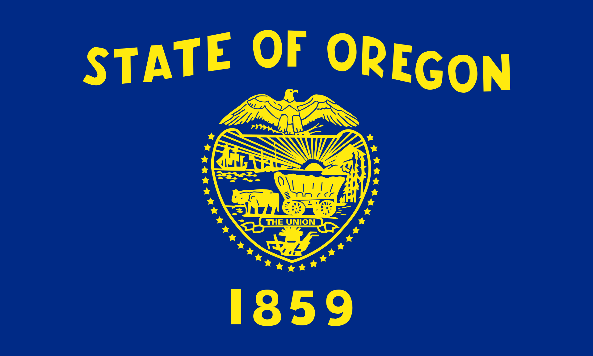
I know what you’re thinking: how can this possibly be the “best” of the worst. It’d be next to impossible for a kid to draw. It’s not exactly distinctive. It’s not simple. There’s lettering and writing all over it and, well, there’s the seal, dead center.
The font actually stands out. It’s not boring block letters like KANSAS or the slightly spaced block letters like M O N T A N A. It looks hand-drawn in a way that’s either meant to be unique or slightly bothersome- I’m really not sure how to feel about it. But Oregon2 wins this list because, unlike a lot of countries in the world- never mind states, it’s different on the back:
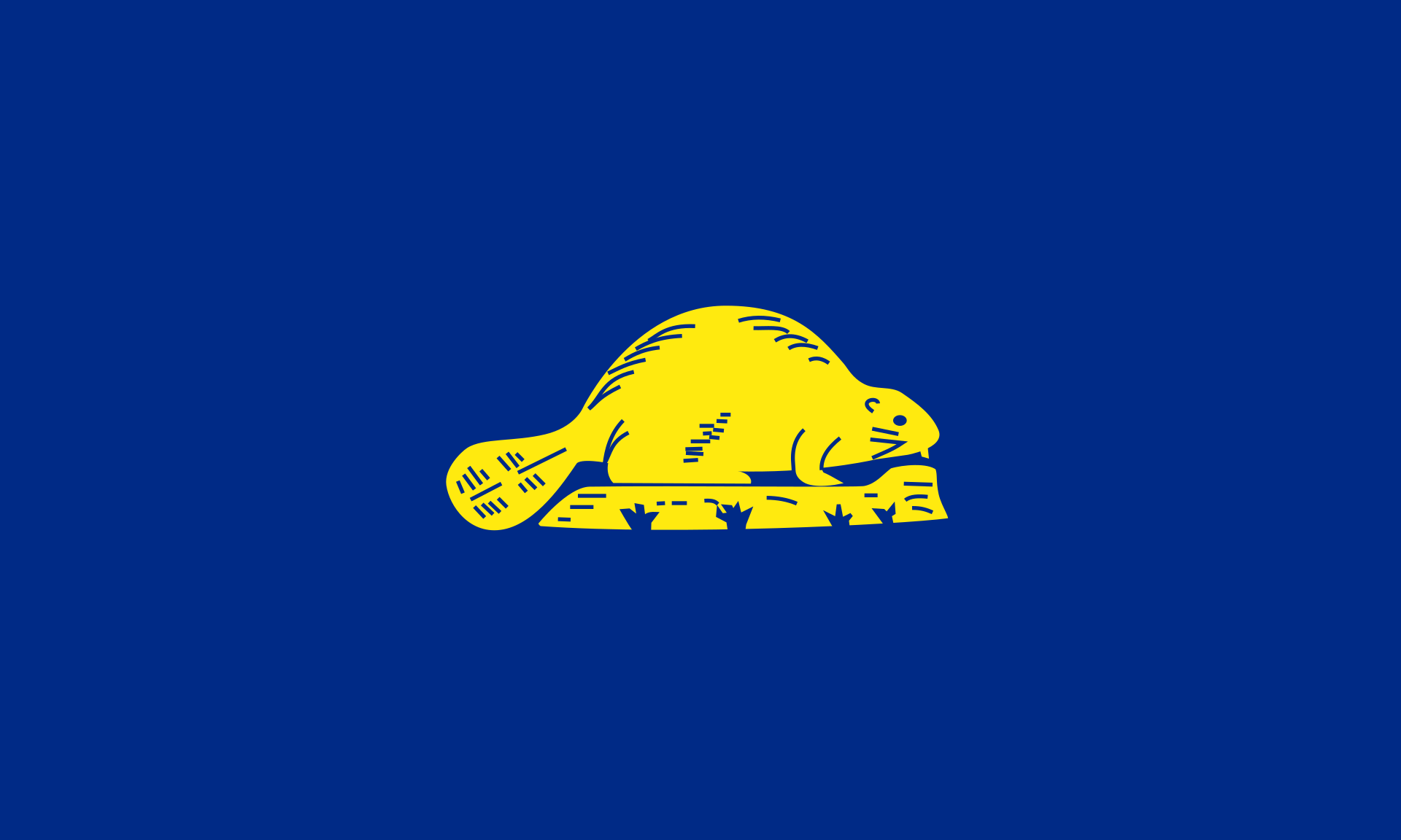
It’s hard not to like a flag with a beaver on the back. And that’s not just because I think Oregon State > Oregon when it comes to college football either. I mean, just look at that dude- it’s just a beaver. Hangin’ out. Doin’ beaver things. He’s almost… cute, really. Now the back of the flag passes NAVA’s precepts with flying colors and given that, I think Oregon takes the top prize.
Lousiana
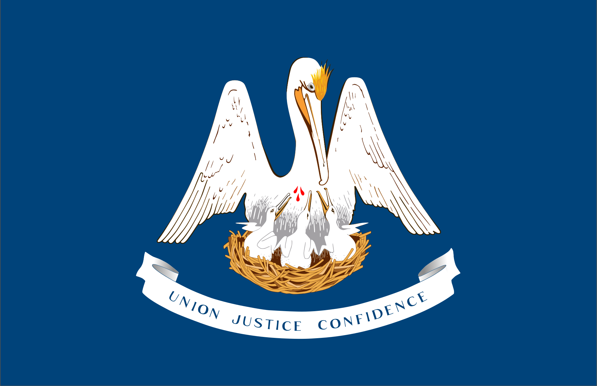
Okay, confession time: pelicans kind of freak me out a little. So given that, this is a fantastic flag. Pelicans: distinctive as hell for Louisiana! Who amongst is not going to see a flag with a gigantic ass pelican on it and not think: “Yup. Louisiana.” Pelicans can be terrifying as the mascot from the New Orleans Pelicans proves. And if in some dystopian future Louisiana wishes to raise its banner and purchase back all them other states through force of arms, I’m damn sure the Pelican Banner would strike fear into the hearts of its enemies.
Or at the very least, make them kind of uncomfortable and uneasy.
But wait, there’s more!
This pelican is actually a heraldic charge representing, “a pelican in her piety”, feeding her young with her blood.
You read that correctly: Mama Pelican is feeding the babies with her blood.
Hardcore.3
It is simple-ish. It’s not too busy color-wise and while the state motto is a design no-no, they didn’t get super wordy with it, so even that doesn’t distract from Mama Pelican doing her thing. Solid, respectable, and slightly terrifying. Eminently worthy of number two on our list.
South Dakota
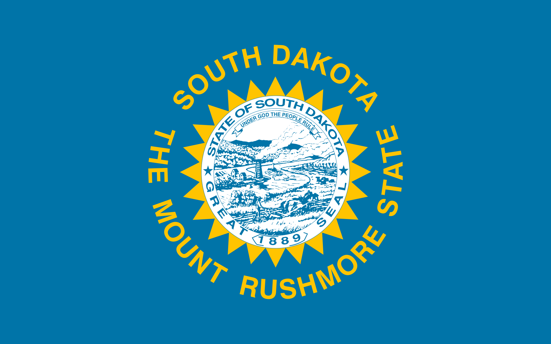
Okay, this is going to sound strange, but it’s the shade of blue that does it for me for South Dakota. It’s utterly unique amongst state flags— I think I’ve seen official descriptors saying it’s supposed to be “the color of the sky” but it’s not sky blue- it’s a shade of teal that’s bordering on turquoise and amongst our ‘Seals on A Bedsheet’ it stands out.
The second design aspect that’s sort of unique is the rays of the sun around the seal. Before they went all-in on The Mount Rushmore State, South Dakota used to be The Sunshine State and that’s what used to be on the bottom half of the seal up until 1992.
Going deeper onto the wiki page, we find that South Dakota actually just had a sun instead of a seal from 1909-1963. Then, they committed the design faux pas and slapped the seal in there from 1963-1992- they also changed the shade of blue to the more traditional dark blue/navy blue that you see in a lot of state flags.
So the post-1992 design changes are a welcome step towards the original 1909 design. The shade of blue: unique. The rays of the sun around the sun? Also unique. The seal… well, let’s be real South Dakota: there is a reason Seals don’t belong on flags and your seal provides the reason. Might be a perfectly good seal full of symbolism about your state, but it does nothing for me, flag-wise.
(There was some noise back in 2012 about getting a new flag for South Dakota and if this proposal ever gets revived, I’d get behind it. Would instantly move South Dakota into the upper tier of state flags.)
Michigan

Hoo-boy, now we’re getting into some law-breakin’ territory. It’s not simple. There are all kinds of colors. Words, words, everywhere. But, it’s got a big-ass moose and a big-ass elk, so it’s distinctive, at least.
There’s a touch of heraldry about this flag that I like. But it’s also Michigan and not the MUNIFICENT REALM OF THE DUKE OF MUSKEGON, so there’s sort of a design mismatch here that Michigan should really think about fixing at some point.
Also: Holy Latin, Batman.
At the very least, you could lose the eagle and the E Pluribus Unum. Y’all are a state in the United States, you don’t need to remind people that you’re in America. TUEBOR means: “I will defend.”4 (Michiganders: Is this true? Will you defend?) And then, we’ve got the white ribbon at the bottom:
Si Quaeris Peninsulam Amoenam…
CIRCUMSPICE
The way this looks on the flag, it almost seems belligerent. “If you seek a pleasant peninsula, buddy: LOOK AROUND YOU!” (And yes, that’s the official state motto- and while it’s Latin and you should pronounce it all fancy-like, but I’m always going to pronounce the ‘spice’ in ‘circumspice’ exactly the way it sounds, because it is just funnier.)
Minnesota
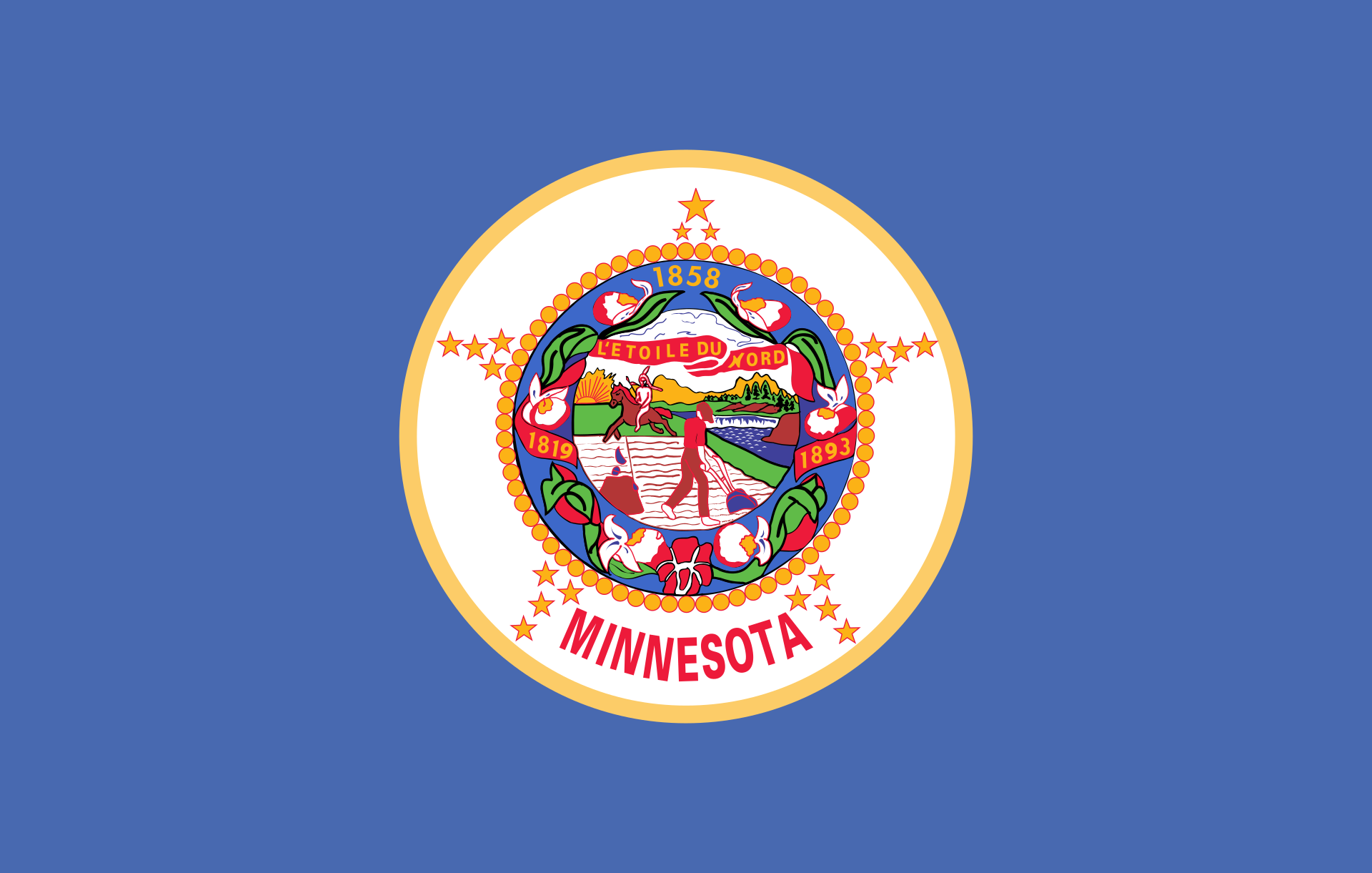
I will admit: Minnesota probably makes this list out of sentiment more than anything else, but there are some points of praise worth noting in this design.
The shade of blue: unique. They’re also ‘The North Star State’ and there’s sort of nice Voltron-like attempt to build a North Star out of clusters of five smaller stars on the edge of the seal.
Beyond that? Eh. The flowers in the seal are nice, but get lost in the general design chaos of the seal itself. You could make an argument that this should be ranked ahead of Michigan just because of the lack of words. (But, there’s also a reason why words are considered a design no-no. People should be able to look at any given flag and just recognize what it represents. You shouldn’t need to put your name on it.)
Minnesota has made some design changes over the years. From 1893 to 1957 it actually had two different background colors on either side of the flag with white on the obverse and royal blue on the reverse. The seal was much bigger and the Voltron-Star more obvious, but there was also a truly obnoxious ribbon that ran across the bottom of the flag. From 1957-1983, it evolved toward its current form, though on a more navy-blue background. The flag has been in its present configuration since 1983.
(There are proposals out there to change Minnesota’s flag— including a fairly serious attempt that lead to the creation of the North Star Flag in 1989. It’s a notion worth reviving!)
I really hope that the redesign movement for municipal flags starts bubbling up to the states at some point. Mississippi managed to redesign theirs, so I see no reason why states can’t improve on these designs merely for the sake of creating a more distinctive flag and not to wrestle with or redress some of the uglier aspects of American history. But the legislative process varies from state to state and it’s messy enough, to begin with, so for now, I’m going to celebrate the best of the so-called ‘worst.’
Many state flags emerged in the late 19th Century when states wanted distinctive symbols for the 1893 World’s Fair. Many of the designs evolved from that starting point before more or less settling into many of their current forms by the 1920s or so.
Oregon’s flag was first adopted in 1925 and what’s believed to be the first flag of Oregon was donated to Eastern Oregon University in 1954 and restored to its former glory in 2010 and looks pretty nice, at least according to this Facebook post from EOU.
The drops of blood were added by law in 2006. They also dropped the “and” from the state motto.
Just not when you’re playing football against Ohio State